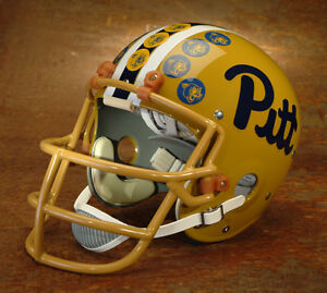
I actually like the block Pitt in some applications. For example, I thought the block Pitt looked really good on our football helmets and on our basketball uniforms.
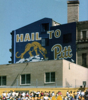
The Block on the Helmets still is not as BOLD as the Script was on the Helmets of the Past. Nothing Should Be BOLDER & BRIGHTER than PITT SCRIPT, just my opinion.
The problem is that it just doesn't hold the same sentimental appeal to most Pitt fans that the script Pitt holds. It is literally no more complicated than that.
Exactly, and why it should have never been changed either and not necessary to hire any consultants to do it, like it was way back in 1997? Just stupidity and ego by one person that did other things right to be fair! But anyone blaming the fans like some here did, are just as myopic and that is a fact, not an opinion?
My core theory on public relations and marketing – and I've done it for a very long time – is that it starts with listening.
Apparently, President Gallagher in less than 4 Months on the job, did much listening, and made a "No Brainer" Decision to dump the "Straw Man" another tried to put on fans!
If you are willing to listen, and you know how to listen, your customers will usually tell you what they want. You may not always agree with their choices but really, that's irrelevant. Your job is not to dazzle people with your brilliance but rather to give them what they want in a reasonable, modern way.
In late 1960's, "Cas" another Athletic Director arrived at Pitt and did much listening, then he asked for action, then it all happen with Sponsors, Contributors, Alumni and Fans, not by Expensive Management Consultants Associates and Friends, or Ego Manic rejected by his own Alma Mater? Deafness was intentionally designed along with selfish arrogance and fans are right not support such mismanagement!
Pitt's greatest mistake under Pederson - and they made it over and over again - was they always skipped that crucial first phase. Instead, they would have a small group of men make decisions for the masses and then foist their brilliant ideas on everyone else and expect everyone to dutifully comply. That is just plain bad marketing.
Amen! I Hear You!
Remember that survey that came out last year? Well, that was the first one we ever got under Pederson. That's strange from a marketing perspective. How do you make decisions without data?
Pederson did the same at NU and was fired for it, after he left Pitt for the sole purpose to go back to NU, then was brought back by another bad decision that cost Pitt Football millions in more mistakes on marketing, coaches, recruiting, and his own buyout? Rebuilding starts with Chancellor Gallagher vision, and AD Barnes job is now to implement that vision starting yesterday!
Now, it must be said that it is entirely possible that they convened market research groups without any of us knowing about it. Frankly, given every other way they did business, that is difficult to believe but it is possible. However, even if you are doing market research, you should still be sending out surveys semi-regularly to get some broad brush data points.
I help set up many Trusts in Wills for some very wealthy Alumni and none chose to leave money to Pitt over their knowledge about how Pitt Athletics was being run. When I posted why this hurts Pitt, another Poster laughed at it....but it revealed why he was one of the Dumbest Posters I ever read on the Lair, and still is, and that is a fact too, not an opinion!
The very people that could have help rebuild the Pitt Program were isolated, turned off, and ended up not just saying but doing...."Forget about Pitt" Football and chose other for other worthy causes, and the same happen at Nebraska. Like NU President Pearl said, Pederson was better at promoting himself more than the university he was suppose to promote and his management style had to be terminated. Again, not any Alumni or Fan was responsible and anyone claiming it is just plain lame and many of those monies in those Trust have sailed away from Pitt due to such mismanagement?
After 19 Years as an Athletic Director, the simple fact remains, is that Steve Pederson could not build a Top 25 Football Program at Pitt or maintain a Top 25 Football Program at Nebraska, and Chancellor Gallagher got that is 16 weeks, after President Pearl got it in5 years?
As I said earlier, in most cases your customers will tell you exactly what they want if you are willing to listen. However, once they tell you what you want you have to have the humility and intelligence to give it to them.
The Scarecrow in the Wizard of OZ was made of "Straw" but he had a Brain and just did not know it, Pederson Brain was on himself, and the pockets of himself and his Consultants, not Pitt or NU and that was the Real Straw Man!
A new Dawn started at Pitt yesterday, let the light kill the hidden bacteria that still remains as a stain that needs to fade at Pitt!