ADVERTISEMENT

New uniforms next season

You spelled Dorsett wrong

No, I don't think he did. The uniforms during Marino's era were much superior to Dorsett's. If you watched highlights of that year, the unis were all over the place, some numbers had gold highlighting, some just had blue or white numbering. No stripes. It looked like a large HS team were some of the players had to wear their JV jerseys.
 
Found some more information from the Nike site on Pitt's new look.

7255332_f260.jpg
 
No, I don't think he did. The uniforms during Marino's era were much superior to Dorsett's. If you watched highlights of that year, the unis were all over the place, some numbers had gold highlighting, some just had blue or white numbering. No stripes. It looked like a large HS team were some of the players had to wear their JV jerseys.

Running backs (particularly Dorsett, who went through several per game) had tearaway jerseys that lacked some of the trim features. I'm under the impression that those are now outlawed.
 
Was at Pitt when TD played and the rumors on campus was that Hawk went through 80 + tear away jerseys his senior year. They are now outlawed

Running backs (particularly Dorsett, who went through several per game) had tearaway jerseys that lacked some of the trim features. I'm under the impression that those are now outlawed.
 
Running backs (particularly Dorsett, who went through several per game) had tearaway jerseys that lacked some of the trim features. I'm under the impression that those are now outlawed.

LOL....we were kids during the late 70's and when we played neighborhood tackle football games some of us would intentionally cut the seams of the neck and sleeves to try and replicate the tear away jerseys, especially made famous by Oklahoma and Nebraska.
 
That was a common practice back then. Most teams scrimped on the details of their tear-away jerseys. Look at Herschel Walker's jerseys when he was at Georgia. They looked nothing like the rest of that team. Every team's uniform during that era had continuity issues.
 
By the way.....Pat Narduzzi is on The Fan right now, and he just said the KDKA depictions of those uniforms are "nothing like they are going to look".

So relax....
 
I think everyone kind of figured that. Those KDKA uniforms look like they were designed by Matt Groening.
 

I wish I could find the photo, but I have a vivid recollection of a shot from a PItt-Temple game that shows a Temple defender sprawled on the ground clutching a piece of cloth with the "33", while Dorsett, pads flapping out of the hole in the back of his jersey, turns upfield. Even though I was at Temple at the time , it was one of the funniest sports photos I've ever seen.
 
Honestly, Pitt does not have a traditional uniform. It has changed its colors, logo...everything. Like it or not, that is our history. Therefore, change the uniform constantly. Change is Pitt's tradition. And with change comes innovation. I say we just embrace it.
 
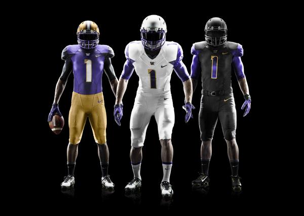
Per Narduzzi, it takes a year to get new uniforms. They've already selected them for next year. Chryst selected this season's. To me, it seemed by his statement that the coaches have a large role in selecting the uniforms both in the recent past and going forward.

Narduzzi said something to the effect that they're really going to be "cool" (not verbatim quote) but said Nike would be pissed if he showed them. He said he had a picture of them on his phone and asked that people please don't steal his phone. That is all he said (and likely all he could say if he didn't already say too much). He didn't get into anything else regarding uniforms other than next years will be different.

With all the Pitt script about, its hard to imagine they would be retro in some fashion. With the current uniforms very close to the original in design, I would have to think they'd be rebooting old colors, but that is just a guess on my part. There was absolutely nothing hinted at or said about that being the actual case.

There were more interesting quotes and tidbits which I'll get into shortly. I highly recommend attending one of these alumni functions with Narduzzi if you get a chance. He is very engaging and forthright. Plus, they give out free Pitt script helmet stickers and other script Pitt swag. Excellent event by the Alumni Association. This is a reason you absolutely should be a member.

Possibly NIKE will add Pitt to that inner circle of schools that get the latest fabrics and styles, and maybe a custom blend color. I would not expect Pitt to become Oregon, but neither are we wearing a timeless look like Bama or PSU. Our current uniforms are...meh. Better with the script than the block, but the navy is too dark and the Vegas gold comes off too greenish. I hope for some sort of tweak of the colors... a tad lighter blue, a gold more toward butterscotch.

The white pants have to go.

Others have posted about the disparity of styles and colors during the 1973-1996 timeframe, and all of it is true.

Jersey stripes weren't consistent in the early years. Pitt used at least 5 different blues and three golds until Steve Pederson replaced the palette in 1997. In the same game you would see different jersey styles on the linemen vs. the backs and receivers. Some players opted for a wide mesh no matter what the weather. It was all very rag-tag and anything BUT uniform.

Mike Gottfried discarded the Majors I colors for the electric royal and bright yellow; Majors tried to restore the colors but whoever was in charge got them wrong... the blue was close but what passed for gold was what one writer called "baby diaper brown". The throwbacks Pitt wore against YSU a few years back harkened to the Gottfried era, not to Majors.

I thought maybe my eyes are playing tricks on me when I see the greenish tint in the gold helmets. It is annoying.
 
You're dumb.
I have no affinity for pederson at all, in case you haven't noticed I'm not exactly broken up over his departure.
You are too much of an obsessed weirdo to ever catch onto things like that.
My former Dean Dr. juhl to no surprise by me made excellent decisions- he's made a career of it.

As usual your prior posts for years made you the weirdo when they fired Pederson, and that is nothing to catch onto, just you being you!
 
I thought maybe my eyes are playing tricks on me when I see the greenish tint in the gold helmets. It is annoying.

Pitt's Vegas was always on the greenish side. But look at old Majors-era pix and you'll see the same thing with the mustard in certain lighting. Weird.

I liked the metallic gold Pitt used before Majors I (1970-72),... more to the orange or bronze.
 
I have to be honest the general plan is EXACTLY what I've wanted Pitt to do for awhile....

1. Pitt script...check
2. Modernize look...chek
3. Do it like Oregon...multiple combos...check...
4. Bring back some type of throwback occasionally ( even if not an exact 70s redo)...check...

Love the plan....I absolutely hate ideas of simply reverting to an old look with no variation...that is the past...Ohio State...ND...Michigan all mix it up....Oregon perhaps the the extreme...yes......but I'll take that..and I'll guess 17-18 old recruits will as well....a kick ass modern look with script in newer (but truer historically) colors is just what I ordered....the mustard was not really Pitts true gold.....

I don't get the complaining given we do not really know much other than what I posted....

I would like to see Pitt go with a traditional look for most games, which is what OSU, ND and Michigan all do. Then once or twice each year, mix it up with a special jersey.

However, what it sounds like Pitt is going to do is the opposite. They are going to mix it up almost every game, and wear the traditional uniform once per season. That is a mistake, imo. It will further dilute the brand Pitt is trying to (re)establish. It works for Oregon because it's what they do. They are the one and only exception. Everyone else wearing something different each games ends up being lame.
 
Last edited:
I would like to see Pitt go with a traditional look for most games, which is what OSU, ND and Michigan all do. Then once or twice each year, mix it up with a special jersey.

However, what it sounds like Pitt is going to do is the opposite. They are going to mix it up almost every game, and wear the traditional uniform once per season. That is a mistake, imo. It will further dilute the brand Pitt is trying to (re)establish. It works for Oregon because it's what they do. They are the one and only exception. Everyone else wearing something different each games ends up being lame.
Its only 9 possible combos...so obviously its nowhere near the extreme of Oregon who is reported to have over 80....

In general the trend is what Pitt is doing...and frankly the PSU model is dead and boring not to mention meaningless....so anything approaching that model sucks.....
 
Uniforms aside... I'd like to see the Pitt "brand" be this:
When you see that script from the other sideline, you know you are for in a looong, tough game. Pitt is going to bring it, play after play, so you better fasten your lids tight. And don't expect Pitt to beat itself.

If that happens and the W's follow, Pitt will look sharp if they come out in blue-and-gold tutus.
 
I'll add complaining about something we have not seen is pretty lame....

The ideas so far sound great and are in tune with what's happening today.....its like arguing you want leather helmets again when its pretty clear thing are not going back.....

The script is back...THAT is a brand.....the overall uniform need not look like the mid 70s "just because".....
 
  • Like
Reactions: JSSTartan
Its only 9 possible combos...so obviously its nowhere near the extreme of Oregon who is reported to have over 80....

In general the trend is what Pitt is doing...and frankly the PSU model is dead and boring not to mention meaningless....so anything approaching that model sucks.....

I know people are saying 9 different combinations, but 3 helmets, 3 jerseys and 3 pants should give them 27 different combinations, plus the alternative and/or throwback. I understand that some teams are following this trend, but none of those teams are very recognizable, with the exception of Oregon. Pitt should keep it simple and go with what makes them look good and unique. We have the script, so that is good, but not yet the total package.
 
The script is back...THAT is a brand.....the overall uniform need not look like the mid 70s "just because".....

Not "just because". Pitt won its last NC with those. Had a Heisman winner with those. And the most important reason, those were the actual school colors.
 
Except they are not actually the school colors....look I'm old enough and was at Pitt Stadium in 76...so I get all that...but its just as important to remember change isn't always bad....Majors 73 change was a drastic one when taken in context of Pitts entire history....mustard wasn't Pitts color...and it was the new thang at that point....

I'm excited to see something new again with the Script being a part of it. Coach Narduzzi says it looks "cool"....so far I'm willing to believe the guy...he seems to "get it"....
 
That and I don't want Pitt to resemble some stodgy stubborn fan base stuck in the past in that in any way shape or form ....like the Cult....
 
And the most important reason, those were the actual school colors.

It's always kind of amusing when someone is so sure about something that they are absolutely wrong about.

Those colors in that little icon you are using to the left of your posts? Yeah, those colors are not, and never have been, Pitt's official school colors. Never. If you want to know what Pitt's actual school colors look like, look at the blue and the gold that we have used on the football uniforms the past few years. That's it. And for that very reason those are the colors we should continue to use.
 
  • Like
Reactions: CaptainSidneyReilly
Those colors in that little icon you are using to the left of your posts? Yeah, those colors are not, and never have been, Pitt's official school colors. Never. If you want to know what Pitt's actual school colors look like, look at the blue and the gold that we have used on the football uniforms the past few years. That's it. And for that very reason those are the colors we should continue to use.

You're right Joe, I believe the current image, albeit a little too large for the circle, is a closer match to Pitt's school colors.

However, The current gold is Vegas gold, so take your amusement and apply it to yourself.
 
  • Like
Reactions: CaptainSidneyReilly
Nope...that's not Pitts colors either...

And the current helmet isn't "Vegas gold" anymore either...nor is the blue the midnight blue introduced in 1997...

Both are different now than the 97 torchcut....don't believe me....go look back at photos or watch the 97 Miami game on you tube.....


Nor does the current color scheme resemble ND ....

Just throwing that out there because that claim eventually comes up...
You are correct , that was midnight blue and Vegas gold and was the best color scheme ever deployed. We do not use either right now despite the constant misinformed reference to it here.
Hopefully Nike will bring it back with script if they do introduce multiple versions of pants jerseys and hats...

Just as long as they stay away from Royal and sh!tty canary yellow
 
  • Like
Reactions: CaptainSidneyReilly
You're dumb.
I have no affinity for pederson at all, in case you haven't noticed I'm not exactly broken up over his departure.
You are too much of an obsessed weirdo to ever catch onto things like that.
My former Dean Dr. juhl to no surprise by me made excellent decisions- he's made a career of it.
Juhl pretty quickly showed just how bad and overpaid was SP.
He also showed that great leaders take their skill set with them and apply it to the situations at hand.
It is a wise lessen to learn......
 
  • Like
Reactions: CaptainSidneyReilly
Juhl pretty quickly showed just how bad and overpaid was SP.
He also showed that great leaders take their skill set with them and apply it to the situations at hand.
It is a wise lessen to learn......

I agree, but plenty of folks knew for over a decade that Steve wasn't a good leader. I know Pitt said all the right things about Steve's departure ("he was great", "it's the situation", etc), but the change in the way things have gone so far tell a different story. Up until the uniform issue, they have pretty much done everything well.
 
Last edited:
  • Like
Reactions: CaptainSidneyReilly
Its only 9 possible combos...so obviously its nowhere near the extreme of Oregon who is reported to have over 80....

In general the trend is what Pitt is doing...and frankly the PSU model is dead and boring not to mention meaningless....so anything approaching that model sucks.....
Druid.....the junk that Walsh put out isn't the real stuff. No way of telling what the actual choices are, but having 3 hat choices makes it 27 combos, I think. Of course, blue jerseys are only for home games, white for away, gold for either?? Lots of striping options, too. Only the totally colorblind will be happy.
 
  • Like
Reactions: CaptainSidneyReilly
Druid.....the junk that Walsh put out isn't the real stuff. No way of telling what the actual choices are, but having 3 hat choices makes it 27 combos, I think. Of course, blue jerseys are only for home games, white for away, gold for either?? Lots of striping options, too. Only the totally colorblind will be happy.

The KDKA images were junk, but it is a safe bet that Pitt's uniforms are going to be comparable to other recent Nike uniform combos. We are going to end up with navy outs, white outs, and all sort of stuff that further dilutes the brand and colors. It was cool for the for couple of times teams did this, but now it has already become passe. Pitt should not make this mistake.

BlhhArzCEAAb_MK.jpg


BlXeFb5CIAEUtl0.png
 
ADVERTISEMENT

Latest posts

ADVERTISEMENT