

Colleges
- AAC
- ACC
- Big 12
- Big East
- Big Ten
- Pac-12
- SEC
- Atlantic 10
- Conference USA
- Independents
- Junior College
- Mountain West
- Sun Belt
- MAC
- More
- Navy
- UAB
- Tulsa
- UTSA
- Charlotte
- Florida Atlantic
- Temple
- Rice
- East Carolina
- USF
- SMU
- North Texas
- Tulane
- Memphis
- Miami
- Louisville
- Virginia
- Syracuse
- Wake Forest
- Duke
- Boston College
- Virginia Tech
- Georgia Tech
- Pittsburgh
- North Carolina
- North Carolina State
- Clemson
- Florida State
- Cincinnati
- BYU
- Houston
- Iowa State
- Kansas State
- Kansas
- Texas
- Oklahoma State
- TCU
- Texas Tech
- Baylor
- Oklahoma
- UCF
- West Virginia
- Wisconsin
- Penn State
- Ohio State
- Purdue
- Minnesota
- Iowa
- Nebraska
- Illinois
- Indiana
- Rutgers
- Michigan State
- Maryland
- Michigan
- Northwestern
- Arizona State
- Oregon State
- UCLA
- Colorado
- Stanford
- Oregon
- Arizona
- California
- Washington
- USC
- Utah
- Washington State
- Texas A&M
- Auburn
- Mississippi State
- Kentucky
- South Carolina
- Arkansas
- Florida
- Missouri
- Ole Miss
- Alabama
- LSU
- Georgia
- Vanderbilt
- Tennessee
- Louisiana Tech
- New Mexico State
- Middle Tennessee
- Western Kentucky
- UTEP
- Florida International University
High School
- West
- Midwest
- Northeast
- Southeast
- Other
- Alaska
- Arizona
- California
- Colorado
- Nevada
- New Mexico
- Northern California
- Oregon
- Southern California Preps
- Washington
- Edgy Tim
- Indiana
- Kansas
- Nebraska
- Iowa
- Michigan
- Minnesota
- Missouri
- Oklahoma Varsity
- Texas Basketball
- Texas
- Wisconsin
- Delaware
- Maryland
- New Jersey Basketball
- New Jersey
- New York City Basketball
- Ohio
- Pennsylvania
- Greater Cincinnati
- Virginia
- West Virginia Preps
ADVERTISEMENT
Install the app
How to install the app on iOS
Follow along with the video below to see how to install our site as a web app on your home screen.
Note: This feature may not be available in some browsers.
You are using an out of date browser. It may not display this or other websites correctly.
You should upgrade or use an alternative browser.
You should upgrade or use an alternative browser.
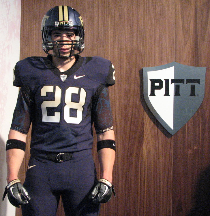
Forge the Future Uniforms
- Thread starter Burgh15
- Start date

I’m thinking The Dark Knight UniformThey remind me of a granite kitchen countertop.
that helmet is definitely some dystopian stuff.
Really who cares about old men’s opinion like yours and mine. I really like them though.
work with young men and you will find out there is a difference in opinion
If ul wears thier normal crap uniforms it could be a battle of ugly uniforms.As long as Pitt wins Saturday, it's all good.
That said, those are complete garbage. Whatever fire they are using to forge the steel, they should throw these uniforms in it just as soon as the game is over and never wear this crap again.
Nike has a junk alternative uni for almost every team.
Oregon has set the bar with the ridiculous number of uni combos. Other than that, I really don't know how much a different look occasionally moves the needle in recruiting. I think its mostly a non-issue.
I have shoes older than you.....and I like the alternate uni’s.I am a grumpy old man (40) who doesn’t like change. I understand young men between 18-22 May think they look great. Just not my cup of tea.
I remember the pre Majors uniforms, and the Dynocat/Pittsburgh fiasco by Peterson.
This stuff is all good, for me....cudo’s.
Better than all of those. Those blue unis just ok.better or worse than these?
I think the new steel ones are better, given efforts to pay homage to Pittsburgh.
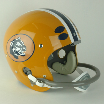
Also this is the third helmet design with a Panther.
1966-67
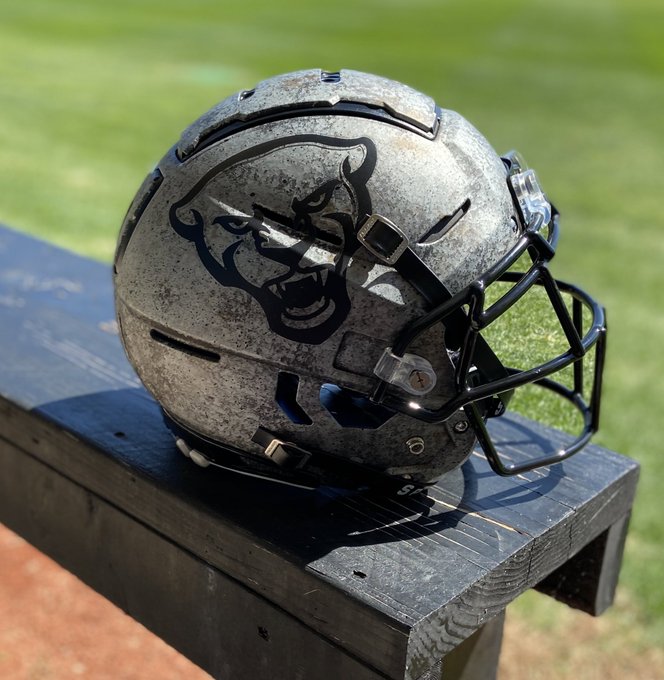
1997-2003

2020 special
Here’s a video with the Nike designer explaining what their thought process was with the design:
The more I see it, the more I think that they should have used the wrought iron neckline design on these alternates for all of the uniforms, instead of the “Cathedral stripe” they used.
The more I see it, the more I think that they should have used the wrought iron neckline design on these alternates for all of the uniforms, instead of the “Cathedral stripe” they used.
Honestly, the arch is fine. But, it's upside down on the pants and I find that incredibly annoying.Here’s a video with the Nike designer explaining what their thought process was with the design:
The more I see it, the more I think that they should have used the wrought iron neckline design on these alternates for all of the uniforms, instead of the “Cathedral stripe” they used.
Iron neckline should be added to current jersey. Arch should pointing upwards like it does on every other Pitt uniform since the redesign expect the football redesign. Arches point up not down. It's ridiculous. I don't understand it.
I think the arch is fine too - but I just think the wrought iron pattern is better, and captures the same inspiration. I think the wrought iron is just really, really sharp.Honestly, the arch is fine. But, it's upside down on the pants and I find that incredibly annoying.
Iron neckline should be added to current jersey. Arch should pointing upwards like it does on every other Pitt uniform since the redesign expect the football redesign. Arches point up not down. It's ridiculous. I don't understand it.
i have an idea and think it's pretty good. how about if we incorporate the gate design into the university and other uniforms? like UNC with their design thingy.
Yes. I concur here. Pittchagg is right. It's the better theme than the Cathedral one and manages to represent Cathedral and the city. And, it's a cleaner look than the Cathedral stripe.i have an idea and think it's pretty good. how about if we incorporate the gate design into the university and other uniforms? like UNC with their design thingy.
Packer today said Pitt should never wear silver and black.
These uniforms should never have been made.
I agree with him.
These uniforms should never have been made.
I agree with him.
Agreed. I just looked through all of the uniforms as documented here: https://spark.adobe.com/page/uV7bLyF0N27zW/Yes. I concur here. Pittchagg is right. It's the better theme than the Cathedral one and manages to represent Cathedral and the city. And, it's a cleaner look than the Cathedral stripe.
I can’t think of a single application of the Cathedral Stripe on those uniforms - across all sports - where this wrought iron pattern wouldn’t look cleaner and better. The Cathedral Stripe suffers from a fatal flaw that it only looks okay (and only makes sense) when it’s vertical. You can’t do it horizontal, and it looks weird upside-down. Those problems are fixed with the wrought iron, while still having the same theme.
Maybe the Nike folks tried both at the time and thought that the stripe translated better to different colors or different sizes, I don’t know. But I can’t help but think that the wrought iron would be better in almost every application, across all sports.
I think the arch is fine too - but I just think the wrought iron pattern is better, and captures the same inspiration. I think the wrought iron is just really, really sharp.
Yes. I concur here. Pittchagg is right. It's the better theme than the Cathedral one and manages to represent Cathedral and the city. And, it's a cleaner look than the Cathedral stripe.
it has begun.
https://www.foco.com/products/pittsburgh-panthers-steel-stripe-face-cover
LMAO at those combat uni’s. WTF was Nike thinking then? Put a smoke stack in the Pitt logo and all done?
The random white kid modeling them along with the game completed the trifecta
The random white kid modeling them along with the game completed the trifecta
Yes. Vertical. Thanks for providing that link. Cathedral stripe looks stellar on the women's hoops jerseys. Very good on the men's hoops jerseys and band uniforms as well. It's a repeating vertical pattern. On ALL of them. Because a repeating arch pattern would be vertical.Agreed. I just looked through all of the uniforms as documented here: https://spark.adobe.com/page/uV7bLyF0N27zW/
I can’t think of a single application of the Cathedral Stripe on those uniforms - across all sports - where this wrought iron pattern wouldn’t look cleaner and better. The Cathedral Stripe suffers from a fatal flaw that it only looks okay (and only makes sense) when it’s vertical. You can’t do it horizontal, and it looks weird upside-down. Those problems are fixed with the wrought iron, while still having the same theme.
Maybe the Nike folks tried both at the time and thought that the stripe translated better to different colors or different sizes, I don’t know. But I can’t help but think that the wrought iron would be better in almost every application, across all sports.
I'm not kidding... I think Nike actually screwed up the football pants. It's vertical on EVERY other jersey or uniform on which it appears after rebrand. It shouldn't but it bothers a lot actually. I truly don't understand. If it was upside down elsewhere I guess I'd think there was method to the madness. But, it's not. So... It's just confusing.
I'm warming up to the new font. The new panther head still looks goofy to me so that hurts the otherwise cool helmet. A plain iron helmet seems like it would be cool to me. Too bad it didn't exist for Ironhead.
Yes, with the look they went I think either a plain iron helmet or one with Pitt script in black outline like the Panther head appears on the helmet makes more sense. I think they really just wanted to showcase the new logo and were hell-bent on doing so. With that, at least it's on the alternate jersey they won't be worn very often.I'm warming up to the new font. The new panther head still looks goofy to me so that hurts the otherwise cool helmet. A plain iron helmet seems like it would be cool to me. Too bad it didn't exist for Ironhead.
Not to mention, we've seen minor tweaks to Pitt jerseys with Nike before. The helmet could easily be updated next season.
The Cathedral stripe corrected on the football pants easily as well. Hell, the iron gate motif replacing said stripe on the football pants and helmet could be done easily too.
Ideally for a jersey goof like me these minor tweaks will happen in the next couple years. Rebrand did just occur a little over a year ago. At least fix the motif on the pants on Pitt's most prominently seen uniform. That's inexcusable to me. Haha.
That’s exactly what I’m thinking. I think it would look fantastic.Yes, with the look they went I think either a plain iron helmet or one with Pitt script in black outline like the Panther head appears on the helmet makes more sense. I think they really just wanted to showcase the new logo and were hell-bent on doing so. With that, at least it's on the alternate jersey they won't be worn very often.
Not to mention, we've seen minor tweaks to Pitt jerseys with Nike before. The helmet could easily be updated next season.
The Cathedral stripe corrected on the football pants easily as well. Hell, the iron gate motif replacing said stripe on the football pants and helmet could be done easily too.
Ideally for a jersey goof like me these minor tweaks will happen in the next couple years. Rebrand did just occur a little over a year ago. At least fix the motif on the pants on Pitt's most prominently seen uniform. That's inexcusable to me. Haha.
Nike way over thought this. It's a freekin alternative uniform, for cripes sake. Every stitch doesn't have to have a special meaning.
Pick something that meets two criteria: 1) looks good, and B) is differentiated from the standard uni.
It's a football uniform, not a wedding dress. The only thing they have in common is they're only going to be worn once.
Pick something that meets two criteria: 1) looks good, and B) is differentiated from the standard uni.
It's a football uniform, not a wedding dress. The only thing they have in common is they're only going to be worn once.
Yes. But, would they then update this motif on the men's, women's basketball jerseys as well?That’s exactly what I’m thinking. I think it would look fantastic.
I think so. Basically, I think wherever the stripe is used now, the wrought iron motif would look better sublimated in. That said, I’m really not a big fan at all of the MBB “big single stripe down only one side of the uniform” template that Nike is using for Pitt and a bunch of other schools. The WBB uniforms having the wrought iron on the neckline - like the football alternates do - would look sharp.Yes. But, would they then update this motif on the men's, women's basketball jerseys as well?
Nike way over thought this. It's a freekin alternative uniform, for cripes sake. Every stitch doesn't have to have a special meaning.
Pick something that meets two criteria: 1) looks good, and B) is differentiated from the standard uni.
It's a football uniform, not a wedding dress. The only thing they have in common is they're only going to be worn once.
you aren't their target market, fella. kids love the different styles. and it's something we have over the PSU's and oklahoma's were we don't have to wear the same uniform for 100 years.
You missed my point, and I don't think kids care one way or the other about the symbolism sewn into a uniform.you aren't their target market, fella. kids love the different styles. and it's something we have over the PSU's and oklahoma's were we don't have to wear the same uniform for 100 years.
My point is they over thought trying to make a good looking alternative uni.
The designers were trying to impress themselves as much as the kids.
Panther head logo in your avatar is the one I like most by the way. Wish they'd brought that back or worked up a variation of it instead of the current Panther head. But, again, new secondary logo could've been A LOT worse as we well know.You missed my point, and I don't think kids care one way or the other about the symbolism sewn into a uniform.
My point is they over thought trying to make a good looking alternative uni.
The designers were trying to impress themselves as much as the kids.
After the disaster know as Dinocat, they could only go up.Panther head logo in your avatar is the one I like most by the way. Wish they'd brought that back or worked up a variation of it instead of the current Panther head. But, again, new secondary logo could've been A LOT worse as we well know.
If they weren't going to go with a real looking cat head like in my avatar, they could have done a lot worse than what they chose.
And the sad part is ul used to have a decent look with the cardinal with teeth on the white helmet.but it’s gone to crap from there.If ul wears thier normal crap uniforms it could be a battle of ugly uniforms.
Now that we finally got it right with the current uniforms we are wearing that has got universal approval and identity with the college football world we present these.I get it it is hopefully for just one game maybe per yer bit it won’t even feel like I am watching Pitt. I know the players and future players love these modern type unis on occasion bu here is what I don’t get. Why when there or no fans in the stand where Pitt could sell merchandise in the stadium and the lots and when no recruits could be allowed on the sidelines. As long as the Panthers win I am good but as Mark Packer said we are gonna look like the old Oakland Raiders who were not too well liked in the burg back in the day.
You missed my point, and I don't think kids care one way or the other about the symbolism sewn into a uniform.
My point is they over thought trying to make a good looking alternative uni.
The designers were trying to impress themselves as much as the kids.
i got your point. agree to disagree, my friend. it's just opinion on styles. nike is trying to sell pitt gear and they thought this would work. whether i like or not, i will root for sales b/c it helps our school.
I'll confess, there may be something to that age theory. 10 or 15 years ago, I would be all in on almost any alternative uniform. Today, I almost automatically call it crap.
I think it looks fine for an alternate uni. I also think it would have looked equally fine without the badges and embroidery to look like gates in the Cathedral.I'll confess, there may be something to that age theory. 10 or 15 years ago, I would be all in on almost any alternative uniform. Today, I almost automatically call it crap.
If the panther was in bright yellow, would that provide a better visual for Pickett to pick up his receivers?Hitting a piece of hot steel with a hammer. Basically what you are seeing in the scene right before that patch makes an appearance.
I’ve been trying for years to figure out why Pitt fans bitch over alternative uniforms... I mean do Oregon fans complain like this?? Somehow I doubt it.
It’s a nice alternate... if they use it 20% of the season and split the other 80% with home/road uniforms we have a winner
I appreciate the cool details of the alternate.. and your crazy if it doesn’t represent Pittsburgh and Pitt very well.
Some of you would remove u unique stuff like the arches , arched numbers and iron neck lines just be... generic. I don’t get it at all.
We’ve had bland numbers ... why go back? Even the Stillers have a unique number compared with their peers. So does Boston College, WVU, Oregon and so on
PSU has a ****ing horrible uniform... but some of you pine for its bland lack of imagination I swear.
Yeah, but you’re in top 5 board troll territory, so I doubt many sane-minded individuals give two cents about your opinion. Enjoy your Saturday, your Nits will be choking soon enough.I'll confess, there may be something to that age theory. 10 or 15 years ago, I would be all in on almost any alternative uniform. Today, I almost automatically call it crap.
Yeah, but you’re in top 5 board troll territory, so I doubt many sane-minded individuals give two cents about your opinion. Enjoy your Saturday, your Nits will be choking soon enough.
Lol. I haven't been to a Nit game since Pitt shut their ass out at TRS 20 years ago.
Just because I'm a fan of their coach, respect a 24-15 record at Vandy, and laughed at our year 2 "Hotseat!" crowd doesn't mean I'm a PSU fan.
Similar threads
- Replies
- 7
- Views
- 1K
- Replies
- 49
- Views
- 3K
- Replies
- 4
- Views
- 674
- Replies
- 17
- Views
- 1K
ADVERTISEMENT
ADVERTISEMENT