

Colleges
- AAC
- ACC
- Big 12
- Big East
- Big Ten
- Pac-12
- SEC
- Atlantic 10
- Conference USA
- Independents
- Junior College
- Mountain West
- Sun Belt
- MAC
- More
- Navy
- UAB
- Tulsa
- UTSA
- Charlotte
- Florida Atlantic
- Temple
- Rice
- East Carolina
- USF
- SMU
- North Texas
- Tulane
- Memphis
- Miami
- Louisville
- Virginia
- Syracuse
- Wake Forest
- Duke
- Boston College
- Virginia Tech
- Georgia Tech
- Pittsburgh
- North Carolina
- North Carolina State
- Clemson
- Florida State
- Cincinnati
- BYU
- Houston
- Iowa State
- Kansas State
- Kansas
- Texas
- Oklahoma State
- TCU
- Texas Tech
- Baylor
- Oklahoma
- UCF
- West Virginia
- Wisconsin
- Penn State
- Ohio State
- Purdue
- Minnesota
- Iowa
- Nebraska
- Illinois
- Indiana
- Rutgers
- Michigan State
- Maryland
- Michigan
- Northwestern
- Arizona State
- Oregon State
- UCLA
- Colorado
- Stanford
- Oregon
- Arizona
- California
- Washington
- USC
- Utah
- Washington State
- Texas A&M
- Auburn
- Mississippi State
- Kentucky
- South Carolina
- Arkansas
- Florida
- Missouri
- Ole Miss
- Alabama
- LSU
- Georgia
- Vanderbilt
- Tennessee
- Louisiana Tech
- New Mexico State
- Middle Tennessee
- Western Kentucky
- UTEP
- Florida International University
High School
- West
- Midwest
- Northeast
- Southeast
- Other
- Alaska
- Arizona
- California
- Colorado
- Nevada
- New Mexico
- Northern California
- Oregon
- Southern California Preps
- Washington
- Edgy Tim
- Indiana
- Kansas
- Nebraska
- Iowa
- Michigan
- Minnesota
- Missouri
- Oklahoma Varsity
- Texas Basketball
- Texas
- Wisconsin
- Delaware
- Maryland
- New Jersey Basketball
- New Jersey
- New York City Basketball
- Ohio
- Pennsylvania
- Greater Cincinnati
- Virginia
- West Virginia Preps
ADVERTISEMENT
Install the app
How to install the app on iOS
Follow along with the video below to see how to install our site as a web app on your home screen.
Note: This feature may not be available in some browsers.
You are using an out of date browser. It may not display this or other websites correctly.
You should upgrade or use an alternative browser.
You should upgrade or use an alternative browser.
Georgia tech rebranding video
- Thread starter ratking17
- Start date

I am glad I wasn't the only one confused.
I mean no offense, but that was not very impressive. And I am not blaming you for that, but it was incredibly underwhelming and confusing.
What did they change?
They just changed the font a little bit. Weird they put out a video for that
Georgia Tech...we have the MEATS..err the GOOOOLLDDD
I live here in GeorgiaIf they hadn't announced the change, I wonder how many non-GT fans would have noticed?
I have no idea even after watching that what was changed?
I live here in Georgia
I have no idea even after watching that what was changed?
They lightened the shade of gold ever so slightly.
Should be the catalyst for some good official school colors debate on the yellow jackets boardThey lightened the shade of gold ever so slightly.
Should be the catalyst for some good official school colors debate on the yellow jackets board
No doubt.
I hear Steve is looking for a job.
No doubt.
I hear Steve is looking for a job.
With how effective that little video was are we sure he wasn't already hired by Tech?
Here come the Atlanta Tech Yellow Jackets...No doubt.
I hear Steve is looking for a job.
Agree, they have the worst uniforms in major college football. I hate the gold they use and the uniforms in general just miss the mark.I wonder how many good recruits they failed to land because they had an apparel deal with Russell Athletic?
Georgia Tech...we have the MEATS..err the GOOOOLLDDD
I immediately thought Arby’s too.
LOL! Now that’s comedy.Here come the Atlanta Tech Yellow Jackets...
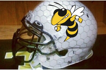
It’s official: they really are our southern twin. LOL!I am not kidding you, they are changing their helmets to this....
Like it
And at least their Ath Dept had enough sense not to change the schools colors from gold and blue to bananas and periwinkle.....and call it a throwback
And at least their Ath Dept had enough sense not to change the schools colors from gold and blue to bananas and periwinkle.....and call it a throwback
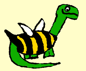
"After our first trip to Pittsburgh we heard so much about this Dino Cat we just had to one up them. I give you... Snake Bee!"I am not kidding you, they are changing their helmets to this....
So they modernized the letters. Looks good. Sort of kind of sort of mid century modern torch cut. That’s what the experts just said in HGTV.
If they gonwith that helmet they will look like some tiny school from the SWAC conference.
On a side note, I have been to bobby dodd twice and it’s a nice walk from midtown into campus and right into the stadium. Very good venue to watch a football game
Also their coach is a slap dick
If they gonwith that helmet they will look like some tiny school from the SWAC conference.
On a side note, I have been to bobby dodd twice and it’s a nice walk from midtown into campus and right into the stadium. Very good venue to watch a football game
Also their coach is a slap dick
Fair point.Like it
And at least their Ath Dept had enough sense not to change the schools colors from gold and blue to bananas and periwinkle.....and call it a throwback
Like it
And at least their Ath Dept had enough sense not to change the schools colors from gold and blue to bananas and periwinkle.....and call it a throwback
Ummmm... Georgia Tech’s official ‘school color’ is Old Gold, just like Pitt. I’m not sure how many times the point needs to be made that none of the countless Old Gold schools actually use it.
I’m not sure how many time the point needs to be made that bananas ain’t gold nor old gold...Ummmm... Georgia Tech’s official ‘school color’ is Old Gold, just like Pitt. I’m not sure how many times the point needs to be made that none of the countless Old Gold schools actually use it.
So I’ll repeat it at least they had enough sense not to turn gold into babanas and blue into periwinkle...And call it throwback
I’m with Paulie B on this one! The more I look at our “throwback” uniforms, the more I dislike them. They’re very cheesy looking. They are not at all satisfying. The yellow is horrific and the blue is worse.
They aren’t “throwbacks” in any real sense and they don’t really invoke any sort of the emotions the throwbacks are supposed to invoke. It just looks like more new colors or typical Pitt incompetence.
If we’re just randomly picking colors on the theory that we think kids might like them, how is that any different than what Steve Pederson was so viciously criticized for?
People didn’t protest what he did because they hate the colors beige and navy blue. They protested because it was departure from our established identity. This is also a departure from our established identity. Now, it is closer to that identity but why not go all the way? Why does everything Pitt does have to be so incremental?
It seems like the trainer or “Chad from marketing” just kind of up and decided on some random yellow and blue that kinda/sorta looked like what Pitt used to wear and they just kind of went from there. That’s definitely unprofessional and that’s not remotely acceptable!
I don’t care what some 48 year-old white dude theorizes what 17 year-old black kids might like. I guarantee you they will like anything you put in front of them because they’re GD 17 years-old! They will like anything shiny and new – because that’s how children’s minds’ work.
Market to the base. Market to the people that actually have money to spend and fund the entire enterprise!
That’s what this program needs – more money!
Give all those people that have stood by the program through thick and mostly thin – and often very, very thin – something for one phucking time in the last 30 years! Give them something to latch onto for God’s sake!
This is not remotely complicated! In fact, it’s embarrassingly easy.
Literally just take a photo of Dan Marino or Tony Dorsett or Hugh Green and hand it to the designer and say, “Here, match this.”
That’s literally all people want.
If you want to put white trim around the script Pitt on the helmet, that would be great! Otherwise, keep the damn colors the same. That’s what people identify with and is all they have wanted for 20 some years now.
Why can’t we do this?! Why does everything we do have to be so unnecessarily complicated? It doesn’t make any sense!
Somebody gets it.I’m with Paulie B on this one! The more I look at our “throwback” uniforms, the more I dislike them. They’re very cheesy looking. They are not at all satisfying. The yellow is horrific and the blue is worse.
They aren’t “throwbacks” in any real sense and they don’t really invoke any sort of the emotions the throwbacks are supposed to invoke. It just looks like more new colors or typical Pitt incompetence.
If we’re just randomly picking colors on the theory that we think kids might like them, how is that any different than what Steve Pederson was so viciously criticized for?
People didn’t protest what he did because they hate the colors beige and navy blue. They protested because it was departure from our established identity. This is also a departure from our established identity. Now, it is closer to that identity but why not go all the way? Why does everything Pitt does have to be so incremental?
It seems like the trainer or “Chad from marketing” just kind of up and decided on some random yellow and blue that kinda/sorta looked like what Pitt used to wear and they just kind of went from there. That’s definitely unprofessional and that’s not remotely acceptable!
I don’t care what some 48 year-old white dude theorizes what 17 year-old black kids might like. I guarantee you they will like anything you put in front of them because they’re GD 17 years-old! They will like anything shiny and new – because that’s how children’s minds’ work.
Market to the base. Market to the people that actually have money to spend and fund the entire enterprise!
That’s what this program needs – more money!
Give all those people that have stood by the program through thick and mostly thin – and often very, very thin – something for one phucking time in the last 30 ****ing years! Give them something to latch onto for God’s sake!
This is not remotely complicated! In fact, it’s embarrassingly easy.
They are throwaway, not throwback
I’m not sure how many time the point needs to be made that bananas ain’t gold nor old gold...
So I’ll repeat it at least they had enough sense not to turn gold into babanas and blue into periwinkle...And call it throwback
Except it's not just a Pitt thing like you are implying... Iowa, WVU, Missouri, Minnesota, ECU, and others have all replaced their "official" school color of Old Gold for more marketable and attractive bright yellows over the years... some of them also with variable shades of yellow and some those yellows are even very 'banana-like".
'Authentic' throw-back color variants or not, Pitt's uniforms are a nod to the past that has received near universal rave feedback both internally and externally, which is all that really matters from a marketing, brand image, and recruitment sense.
Bananas and periwinkle are not Navy and Old Gold.Except it's not just a Pitt thing like you are implying... Iowa, WVU, Missouri, Minnesota, ECU, and others have all replaced their "official" school color of Old Gold for more marketable and attractive bright yellows over the years... some of them also with variable shades of yellow and some those yellows are even very 'banana-like".
'Authentic' throw-back color variants or not, Pitt's uniforms are a nod to the past that has received near universal rave feedback both internally and externally, which is all that really matters from a marketing, brand image, and recruitment sense.
I don’t give a Flip what the hoopies or Iowa have done.
Those so-called throwbacks are hideous
We have a great color scheme that shouldn’t be changed to garbage just because it focused group well.
At the end of the day I will be very surprised if even the Yummies in the Pitt Ath Dept vote to keep that crap.
We should end up with something close to Navy and maybe a bit brighter Gold than currently showing.
Speaking of logos and colors, I have a question for the masses. From when, or for how long, do you think the logo RaleighPittFan uses as an avatar was used by Pitt? I had items from the 80s with this logo on it, and it might have made it into the 90s on some merchandise, but was surprised by where I found it.Marion Center should use that helmet in green.
That's a good question. I'm looking forward to learning the answer.
That's a good question. I'm looking forward to learning the answer.
I think I may have to start a new thread. I'm curious what people know/think.
Honestly, the only place I ever remember seeing that logo was on banners and pennants. I think I may have seen on a few T-shirts as well but not in large quantities. That would’ve been the late 70s and early 80s. I don’t remember seeing that any other time and I’m not sure it was ever really officially used?
It was almost like an unofficial logo whenever an item needed a graphic panther rather than a woodmark. It’s a little bit like what you see with a lot of Big 10 schools and their musclebound Buckeye/Badger/Wolverine/ Spartan/whatever.
It was a much more innocent time.
All I remember from that time is the script Pitt and the long full-bodied panther which was slinking across the name – which also looked awesome! They used those pretty interchangeably and I really liked both of those logos. I especially liked/like those colors.
Honestly, the only place I ever remember seeing that logo was on banners and pennants. I think I may have seen on a few T-shirts as well but not in large quantities. That would’ve been the late 70s and early 80s. I don’t remember seeing that any other time and I’m not sure it was ever really officially used?
It was almost like an unofficial logo whenever an item needed a graphic panther rather than a woodmark. It’s a little bit like what you see with a lot of Big 10 schools and their musclebound Buckeye/Badger/Wolverine/ Spartan/whatever.
It was a much more innocent time.
All I remember from that time is the script Pitt and the long full-bodied panther which was slinking across the name – which also looked awesome! They used those pretty interchangeably and I really liked both of those logos. I especially liked/like those colors.
It appeared on all sorts of merchandise in the 80s. Stickers, wastebaskets, games, hats, seat cushions, clothes, flags, mugs...almost everything in the 80s. Of course, it was only one of multiple logos that appeared on things, as did the Panther crawling along the block Pitt and the script Pitt with and without various different Panthers. I think at any one time there were probably like 5 Panther logos.


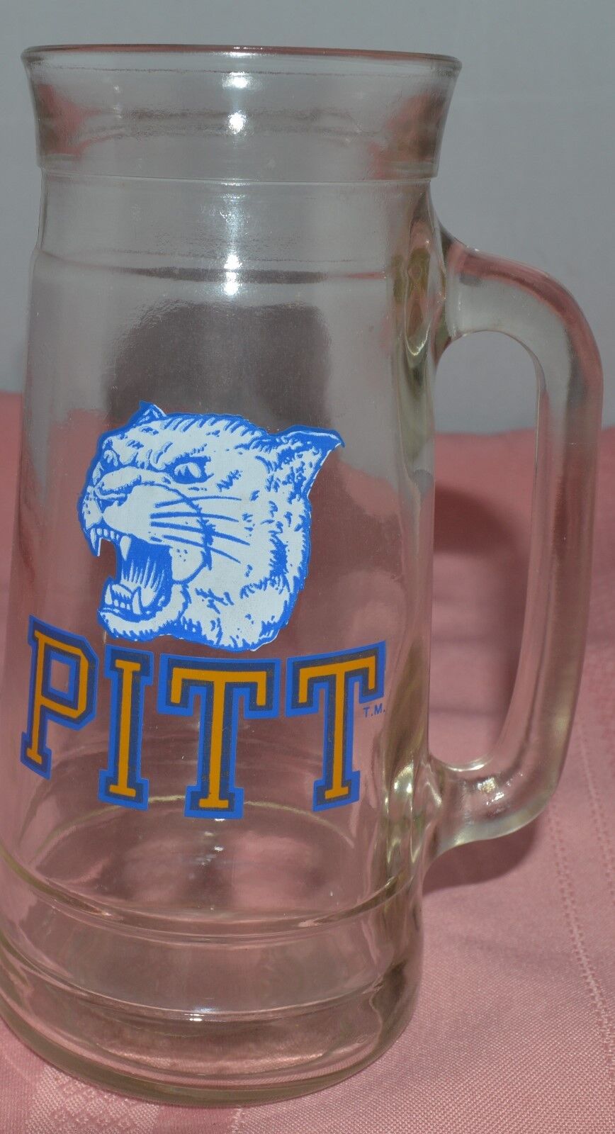


It's seen here on a currently sold heritage banner.
By the way, the "muscle bound Panther", as below, dates to the 1950s. It is one of my favorites and has been making a comeback of late on some throwback items.

Last edited:
Similar threads
- Replies
- 0
- Views
- 165
- Replies
- 11
- Views
- 599
- Replies
- 39
- Views
- 2K
- Replies
- 19
- Views
- 1K
ADVERTISEMENT
ADVERTISEMENT