Some on here have wondered when we went from mustard gold helmets/pants to the yellow helmets/pants.I can now pin point it down to 1985.I was watching a game on you tube from 1985 v nc state and noticed this.The only difference between the 1984 uniforms and 1985 was script pitt on the shoulders.In 1986 the yellow pants and helmets were used.The change to the basketball uniforms also came in 1986.That was the first year script pitt was on the front of basketball jersey.In 85-86 we still had the funky side ways pitt on the front.
Colleges
- American Athletic
- Atlantic Coast
- Big 12
- Big East
- Big Ten
- Colonial
- Conference USA
- Independents (FBS)
- Junior College
- Mountain West
- Northeast
- Pac-12
- Patriot League
- Pioneer League
- Southeastern
- Sun Belt
- Army
- Charlotte
- East Carolina
- Florida Atlantic
- Memphis
- Navy
- North Texas
- Rice
- South Florida
- Temple
- Tulane
- Tulsa
- UAB
- UTSA
- Boston College
- California
- Clemson
- Duke
- Florida State
- Georgia Tech
- Louisville
- Miami (FL)
- North Carolina
- North Carolina State
- Pittsburgh
- Southern Methodist
- Stanford
- Syracuse
- Virginia
- Virginia Tech
- Wake Forest
- Arizona
- Arizona State
- Baylor
- Brigham Young
- Cincinnati
- Colorado
- Houston
- Iowa State
- Kansas
- Kansas State
- Oklahoma State
- TCU
- Texas Tech
- UCF
- Utah
- West Virginia
- Illinois
- Indiana
- Iowa
- Maryland
- Michigan
- Michigan State
- Minnesota
- Nebraska
- Northwestern
- Ohio State
- Oregon
- Penn State
- Purdue
- Rutgers
- UCLA
- USC
- Washington
- Wisconsin
High Schools
- Illinois HS Sports
- Indiana HS Sports
- Iowa HS Sports
- Kansas HS Sports
- Michigan HS Sports
- Minnesota HS Sports
- Missouri HS Sports
- Nebraska HS Sports
- Oklahoma HS Sports
- Texas HS Hoops
- Texas HS Sports
- Wisconsin HS Sports
- Cincinnati HS Sports
- Delaware
- Maryland HS Sports
- New Jersey HS Hoops
- New Jersey HS Sports
- NYC HS Hoops
- Ohio HS Sports
- Pennsylvania HS Sports
- Virginia HS Sports
- West Virginia HS Sports
ADVERTISEMENT
You are using an out of date browser. It may not display this or other websites correctly.
You should upgrade or use an alternative browser.
You should upgrade or use an alternative browser.
uniforms of the past
- Thread starter Black Panther
- Start date
Like I said the 86 version was similar to the 85 version but yellow instead of mustard.they changed again in 87.helmet was the same but changed jersey and pants.changed again in 89 going back to something similar to 86.and that lasted til majors 2 and back to mustard.and then the complete color change in 97.
Mistaken on the 86 jerseys.they had no script Pitt shoulder logo like 85.the shoulder Pitt logo came back in 89.
Some on here have wondered when we went from mustard gold helmets/pants to the yellow helmets/pants.I can now pin point it down to 1985.I was watching a game on you tube from 1985 v nc state and noticed this.The only difference between the 1984 uniforms and 1985 was script pitt on the shoulders.In 1986 the yellow pants and helmets were used.The change to the basketball uniforms also came in 1986.That was the first year script pitt was on the front of basketball jersey.In 85-86 we still had the funky side ways pitt on the front.
If I remember correctly the “funky sideways” script is actually closer to William Pitt’s signature than the Majors Pitt Script. For that reason I don’t think that one should completely go away.
Some on here have wondered when we went from mustard gold helmets/pants to the yellow helmets/pants.I can now pin point it down to 1985.I was watching a game on you tube from 1985 v nc state and noticed this.The only difference between the 1984 uniforms and 1985 was script pitt on the shoulders.In 1986 the yellow pants and helmets were used.The change to the basketball uniforms also came in 1986.That was the first year script pitt was on the front of basketball jersey.In 85-86 we still had the funky side ways pitt on the front.
It is frustrating how many different shades we have had for our colors.
the '87 had the bicentennial patch of course but also did the stripes on the sleeves, I don't recall any other year they did this.. I kind of liked it..
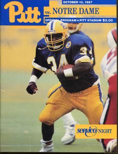
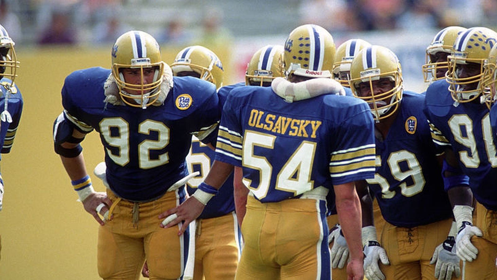


Why? LOL.It is frustrating how many different shades we have had for our colors.
I never thought about it much, I always thought of Pitt's colors as some variation of blue and yellow/gold.
Well we’ve covered every shade of blue and gold that exists. Is it frustrating? Comical? Probably a little bit of both.Why? LOL.
I never thought about it much, I always thought of Pitt's colors as some variation of blue and yellow/gold.
Regarding branding, we’ve broken every rule that exists and some rules that haven’t even been written yet.
I prefer where they are going now, Pitt script with VERY BRIGHT blue and yellow. I can't say I've ever been "frustrated" by any of it.Well we’ve covered every shade of blue and gold that exists. Is it frustrating? Comical? Probably a little bit of both.
Regarding branding, we’ve broken every rule that exists and some rules that haven’t even been written yet.
well if you like very bright blue, you should be ecstatic. you don't get brighter than what we have now.. It looks like a blue you'd see in a Pixar movie.I prefer where they are going now, Pitt script with VERY BRIGHT blue and yellow. I can't say I've ever been "frustrated" by any of it.

I do, I really like that! Hated the recent colors, that where so dull and made them look like ND, Navy and GT from a distance. With these colors and the script logo, there's no doubt what team you're watching.well if you like very bright blue, you should be ecstatic. you don't get brighter than what we have now.. It looks like a blue you'd see in a Pixar movie.

Why? LOL.
I never thought about it much, I always thought of Pitt's colors as some variation of blue and yellow/gold.
Frustrating because we had a great uniform and messed it up.
Now we are going back to the same design more or less.Frustrating because we had a great uniform and messed it up.
Now we are going back to the same design more or less.
I certainly hope you are correct.
Because different people come and go from the program year in and out, look to be promoted (more likely to get new jobs at better schools) and the only way to do so is to change, change, change. Was it good before? Bad before? Popular? Unpopular? Almost doesn't matter. If you keep things the same, you're not "dynamic," and definitely not "young" ... thus risk being stuck in place (or a scapegoat for failure).It is frustrating how many different shades we have had for our colors.
You see it all the time in the corp world. Someone gets promoted, gotta change everything up. Whether it becomes fubar as a result is not even important... you have to show you will EMBRACE CHANGE. The worst, most fatal thing someone can do is keep things the same... good or bad.
Let's face it, we're diehard lifer Pitt folks but the great, great majority of everyone else working for Pitt athletics (either internal or external, such as for Nike) see us as steppingstone to something better. Say you are the team lead for Pitt at Nike's slave labor camp in Vietnam. You hunger, maybe literally so, to get out of that fetid hell hole and to HQ where the all stars get to work on glamour accounts. Pitt is a stinking dead raccoon in comparo. All you are looking for is to pump something out as quickly and cheaply as possible. But different enough so you get noticed. Frankly your counterpart in Pitt AD is the same... likely recently hired from Directional Michigan but really desperate to move on to Ohio State. He or she similarly is just looking to change things up, show he's a mover and shaker. Honestly, maybe the more controversial the look, the better... even if repulsive. Merely keeping the look of the old throwbacks? Who can get promoted that way?
Don't get me wrong.I like it.Just didn't know that's what it was.Good looking logo too.If I remember correctly the “funky sideways” script is actually closer to William Pitt’s signature than the Majors Pitt Script. For that reason I don’t think that one should completely go away.
LOL! That’s perfect! The Pixar Panthers.well if you like very bright blue, you should be ecstatic. you don't get brighter than what we have now.. It looks like a blue you'd see in a Pixar movie.

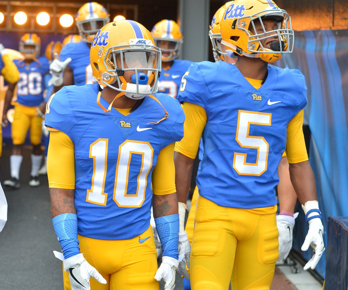
the more I see these unis, the more I may accept that im just color blind. I've never seen such fluctuation of the blue from pic to pic as a home Pitt retro jersey. Yeah, I get lighting changes it a bit but with Pitt blue Retro jerseys, these things go from one end of the color spectrum to the other..LOL! That’s perfect! The Pixar Panthers.
I mean, you guys are telling me this is the same blue, just different lighting. I give up, im blind and I need to accept this and adust accordingly.

If I remember correctly the “funky sideways” script is actually closer to William Pitt’s signature than the Majors Pitt Script. For that reason I don’t think that one should completely go away.
Here are two examples of William Pitt the Elder's actual signature:

Below is the "logo", created by Agnes Lynch Starret in 1939 for the alumni magazine, that was stated to intentionally be a facsimile of William Pitt the Elder's signature (obviously more like the first example above).
The "signature Pitt" was worn on sweatshirts and found on other stuff in the 1950s. This is an image of Len Casanova wearing a "signature Pitt" sweatshirt in 1951.

These are the throwback (scripty) and official Pitt scripts for comparison. The scripty one is clearly more like the second example of the actual signature than the first, while the bubbly "official script", said to be designed by Bob Gessner in 1973, is really just stylized cursive and hard to say it really is a facsimile of the autograph at all, although you can say it evolved from the prior logos.


For bandies, here's side-by-side drum major uniform comparison of what is probably a circa 1950s uniform with the "signature Pitt" vs the late 1970-early 80s "official script Pitt."

Last edited:
Well
Heres a question,
Will the blue be the same shade for every team?
I ask seriously
Because the blue in those throwbackd looks much lighter than the very sweet blue in the baseball jerseys from another thread.
Please tell me they wont eff this up and have different shades for different teams.
Heres a question,
Will the blue be the same shade for every team?
I ask seriously
Because the blue in those throwbackd looks much lighter than the very sweet blue in the baseball jerseys from another thread.
Please tell me they wont eff this up and have different shades for different teams.
the more I see these unis, the more I may accept that im just color blind. I've never seen such fluctuation of the blue from pic to pic as a home Pitt retro jersey. Yeah, I get lighting changes it a bit but with Pitt blue Retro jerseys, these things go from one end of the color spectrum to the other..
I mean, you guys are telling me this is the same blue, just different lighting. I give up, im blind and I need to accept this and adust accordingly.


It's not just lighting, it is camera settings. Regardless, we appear to be going to a canary yellow and royal blue color scheme that has been used previously about 7 or 8 years in Pitt's entire 232 year history. It's less traditional at this point than vegas gold and midnight/navy which has been used for over two decades now. The school's original colors are Navy and Old Gold. In fact, I ran across a student newspaper article once from the 1920s or so complaining about a batch of Pitt items in the bookstore because the blue was too light and I think they let you turn them in for replacements with darker blue. What we are moving towards isn't traditional in any sense. Whether it makes sense for branding is a different story. But color shades are fads, and undoubtedly, the new colors will be changed again sometime in the future when neon bright colors are no longer popular or distinctive.
What shade of gold? Look at your varsity letter jacket to find out.


Last edited:
Here are two examples of William Pitt the Elder's actual signature:


Below is the "logo", created by Agnes Lynch Starret in 1939 for the alumni magazine, that was stated to intentionally be a facsimile of William Pitt the Elder's signature (obviously more like the first example above).

The "signature Pitt" was worn on sweatshirts and found on other stuff in the 1950s. This is an image of Len Casanova wearing a "signature Pitt" sweatshirt in 1951.
These are the throwback (scripty) and official Pitt scripts for comparison. The scripty one is clearly more like the second example of the actual signature than the first, while the bubbly "official script", said to be designed by Bob Gessner in 1973, is really just stylized cursive and hard to say it really is a facsimile of the autograph at all, although you can say it evolved from the prior logos.


For bandies, here's side-by-side drum major uniform comparison of what is probably a circa 1950s uniform with the "signature Pitt" vs the late 1970-early 80s "official script Pitt."

I really like Pitt's signature. I think it looks cool. I am guessing that most people don't know much about the Pitts.
the more I see these unis, the more I may accept that im just color blind. I've never seen such fluctuation of the blue from pic to pic as a home Pitt retro jersey. Yeah, I get lighting changes it a bit but with Pitt blue Retro jerseys, these things go from one end of the color spectrum to the other..
I mean, you guys are telling me this is the same blue, just different lighting. I give up, im blind and I need to accept this and adust accordingly.


You're correct they aren't the same. The bottom version is what the new colors look like.
Cartoonish? Look like Tulsa's circa 2000. Or USheLAwell if you like very bright blue, you should be ecstatic. you don't get brighter than what we have now.. It looks like a blue you'd see in a Pixar movie.

like to see us use the San Jose st blue and gold. I think we are close. not the unis, just the color scheme.Cartoonish? Look like Tulsa's circa 2000. Or USheLA

Something as simple as a white balance setting on the camera could cause the difference in these two pictures.the more I see these unis, the more I may accept that im just color blind. I've never seen such fluctuation of the blue from pic to pic as a home Pitt retro jersey. Yeah, I get lighting changes it a bit but with Pitt blue Retro jerseys, these things go from one end of the color spectrum to the other..
I mean, you guys are telling me this is the same blue, just different lighting. I give up, im blind and I need to accept this and adust accordingly.


We had those on the band uniform as well that yearthe '87 had the bicentennial patch of course but also did the stripes on the sleeves, I don't recall any other year they did this.. I kind of liked it..


I know, they are friggin' BEAUTIFUL UNIFORMS.... LOVE IT!!!Cartoonish? Look like Tulsa's circa 2000. Or USheLA
HOW THEY BECOME permanent FOREVER!
the more I see these unis, the more I may accept that im just color blind. I've never seen such fluctuation of the blue from pic to pic as a home Pitt retro jersey. Yeah, I get lighting changes it a bit but with Pitt blue Retro jerseys, these things go from one end of the color spectrum to the other..
I mean, you guys are telling me this is the same blue, just different lighting. I give up, im blind and I need to accept this and adust accordingly.


Two things look at any team over a variety of different photographers... you’ve just never spent time looking at other schools
Start with Clemson... I’ve seen photos *from the same game* where colors look different... when you think of the variables.. type of camera, lighting, filters, printed vs pixels etc before you even see a “ picture “ you can understand how easy it is to get fluctuations...Hell daytime vs night with artificial lights makes a huge difference...
Everyone’s camera isn’t set the same
What did Dorsett wear??like to see us use the San Jose st blue and gold. I think we are close. not the unis, just the color scheme.

Irrelevant to everything. Who cares what he wore?What did Dorsett wear??
But YOU care because AVP wore those comic book colors??? Did you buy a jukebox from Hackett??Irrelevant to everything. Who cares what he wore?
WTF is AVP?But YOU care because AVP wore those comic book colors??? Did you buy a jukebox from Hackett??
I just really like the "comic book colors", they look really cool to me. They've been dressed in drab for over 20 years, bright, "comic book colors" are refreshing to me.
The uniforms where basically the same from 1973 to 1997, I think yes, the shades of colors changed every once I awhile.Up until the Pittsburgh-Dino Cat re-brand weren't most of the changes to the shades of blue and gold due to what the uniform suppliers offered?
Alex Van Pelt?WTF is AVP?
I just really like the "comic book colors", they look really cool to me. They've been dressed in drab for over 20 years, bright, "comic book colors" are refreshing to me.
Oh yeah, dude that was 30 years ago, And even then I never called him AVP.Alex Van Pelt?
Up until about 85 Pitt was wearing what appears to be the actual school colors of old gold and light navy blue.once gottfried got here they went to royal and yellow.86 seemed to be the transitional year.in 87 full blown royal and yellow.Up until the Pittsburgh-Dino Cat re-brand weren't most of the changes to the shades of blue and gold due to what the uniform suppliers offered?
the more I see these unis, the more I may accept that im just color blind. I've never seen such fluctuation of the blue from pic to pic as a home Pitt retro jersey. Yeah, I get lighting changes it a bit but with Pitt blue Retro jerseys, these things go from one end of the color spectrum to the other..
I mean, you guys are telling me this is the same blue, just different lighting. I give up, im blind and I need to accept this and adust accordingly.


Agreed but I think it's the same, have to consider 1 was a day game, another a night . Camera settings as mentioned above. And the ACC Championship game was in rain which darkens the fabric from the get go as well. I had a similar light blue pull over that night in Charolotte and by end of the game it was significantly darker shade as well.
Similar threads
- Replies
- 19
- Views
- 2K
- Replies
- 28
- Views
- 2K
- Replies
- 0
- Views
- 232
- Replies
- 6
- Views
- 788
ADVERTISEMENT
ADVERTISEMENT