
That's the flag of Pittsburgh, not the University of Pittsburgh's colors.
Colleges
- American Athletic
- Atlantic Coast
- Big 12
- Big East
- Big Ten
- Colonial
- Conference USA
- Independents (FBS)
- Junior College
- Mountain West
- Northeast
- Pac-12
- Patriot League
- Pioneer League
- Southeastern
- Sun Belt
- Army
- Charlotte
- East Carolina
- Florida Atlantic
- Memphis
- Navy
- North Texas
- Rice
- South Florida
- Temple
- Tulane
- Tulsa
- UAB
- UTSA
- Boston College
- California
- Clemson
- Duke
- Florida State
- Georgia Tech
- Louisville
- Miami (FL)
- North Carolina
- North Carolina State
- Pittsburgh
- Southern Methodist
- Stanford
- Syracuse
- Virginia
- Virginia Tech
- Wake Forest
- Arizona
- Arizona State
- Baylor
- Brigham Young
- Cincinnati
- Colorado
- Houston
- Iowa State
- Kansas
- Kansas State
- Oklahoma State
- TCU
- Texas Tech
- UCF
- Utah
- West Virginia
- Illinois
- Indiana
- Iowa
- Maryland
- Michigan
- Michigan State
- Minnesota
- Nebraska
- Northwestern
- Ohio State
- Oregon
- Penn State
- Purdue
- Rutgers
- UCLA
- USC
- Washington
- Wisconsin
High Schools
- Illinois HS Sports
- Indiana HS Sports
- Iowa HS Sports
- Kansas HS Sports
- Michigan HS Sports
- Minnesota HS Sports
- Missouri HS Sports
- Nebraska HS Sports
- Oklahoma HS Sports
- Texas HS Hoops
- Texas HS Sports
- Wisconsin HS Sports
- Cincinnati HS Sports
- Delaware
- Maryland HS Sports
- New Jersey HS Hoops
- New Jersey HS Sports
- NYC HS Hoops
- Ohio HS Sports
- Pennsylvania HS Sports
- Virginia HS Sports
- West Virginia HS Sports
ADVERTISEMENT
You are using an out of date browser. It may not display this or other websites correctly.
You should upgrade or use an alternative browser.
You should upgrade or use an alternative browser.
Jerseys and helmets look awesome
- Thread starter VolPanther
- Start date
Old gold and navy blue were the official colors adopted back in the 1800s. It was based on the commonwealth of Pennsylvania's colors (see PA flag) as Pitt was named the Western University of Pennsylavia from 1819 to 1908. The gold color should be about the shade that you see in the "P" of varsity letter jackets.
Old gold.Old gold and navy blue were the official colors adopted back in the 1800s. It was based on the commonwealth of Pennsylvania's colors (see PA flag) as Pitt was named the Western University of Pennsylavia until 1908. The gold color should be about the shade that you see in the "P" of varsity letter jackets.
https://en.wikipedia.org/wiki/Old_gold
I agree it could be but everything from paint schemes on buildings on campus to letterhead is now with this scheme. Plus I believe historically speaking the colors have been closer to these new official colors ....the mustard canary etc was not as universal for the school.
When the royal and mustard were in vogue, you could buy sweats in blue, navy , gray or gold, but navy was the most popular choice. People like navy blue for a reason. It is flattering to most. I say, brighten the gold a little and pair it with navy and you have a winner of a combo with the brighter colors as the alternate.Because like I said, for whatever reason it is more important to some people to have unique colors that we can call our own rather than colors that actually look good.
I'll tell you what. Go in to any men's store in the country tomorrow and look and see if you can find any shirts for sale there that are either the color of blue that we wore today or the color of yellow that we wore today. I could save you some time though and tell you that you aren't going to find any. And the reason for that is that no one would buy and wear a shirt of either of those colors for anything other than a Pitt sporting event. Because those colors are ugly.
The Vegas Gold is the problem. Too washed out and too greenish.I agree it could be but everything from paint schemes on buildings on campus to letterhead is now with this scheme. Plus I believe historically speaking the colors have been closer to these new official colors ....the mustard canary etc was not as universal for the school.
The throwbacks certainly are bright -- made the GT uniforms look pretty drab. But I thought I was watching LSU North...
I really don't give a crap what Pitt wears if we win.
Go Pitt.
I really don't give a crap what Pitt wears if we win.
Go Pitt.
Gotta correct this, Vegas Gold is long gone.The Vegas Gold is the problem. Too washed out and too greenish.
The new unis are not Vegas Gold which was put in place when Smiley replaced script with Pittsburgh and Midnight Blue/Vegas Glod
Whatever the Gold we use now (and not that sh!tty yellow from yesterday ) is actually much different ...
But one thing , had aPitt Tee with this current gold in Block Pitt letters and damn after many many washings the Gold turned Green....I kid you not.
What are our colors? It seems that Pitt has exercised artistic license through the years, so I'm a bit perplexed what exactly the colors SHOULD be.
That's because you are confusing the colors that our sports teams have worn with the actual school colors. The school colors have been the same for a long time, many decades, probably more than 100 years. The fact that sometimes during those years we have had sports teams wear different colors doesn't mean that the school colors changed, it means that we were wearing uniforms that weren't in the school colors. Like the ones we wore yesterday.
So if the school colors are navy and old gold as Paco said, should our new uni's have reflected that?That's because you are confusing the colors that our sports teams have worn with the actual school colors. The school colors have been the same for a long time, many decades, probably more than 100 years. The fact that sometimes during those years we have had sports teams wear different colors doesn't mean that the school colors changed, it means that we were wearing uniforms that weren't in the school colors. Like the ones we wore yesterday.
So if the school colors are navy and old gold as Paco said, should our new uni's have reflected that?
Our new uniforms are pretty much the school colors. Unless you are referring to the new uniforms that we wore yesterday, because those are nothing like the school colors.
Well the navy is navy, but the gold is different. Oh well.Our new uniforms are pretty much the school colors. Unless you are referring to the new uniforms that we wore yesterday, because those are nothing like the school colors.
Were the official colors originally selected for some meaning associated with the colors or were they just chosen for their look and identification as was the Stars and Stripes in 1777?
If they had a specific meaning, then using these colors has some statement to convey and should be worn as the Pitt standard.
Otherwise the change of colors is simply a matter of choice and can change with the times.
If they had a specific meaning, then using these colors has some statement to convey and should be worn as the Pitt standard.
Otherwise the change of colors is simply a matter of choice and can change with the times.
I agree with whoever called yesterday's unis hideous. The colors belong in the past with disco balls and leisure suits. Notwithstanding yesterday's choice, the rest of this season's uniforms are outstanding. The matte navy helmet is a winner.There is a reason that no one else in the country uses those colors. They are ugly. They always have been. They always will be. Some folks are so enamored with having "our own" colors that they are willing to overlook that fact. It doesn't make it any less true.
Were the official colors originally selected for some meaning associated with the colors or were they just chosen for their look and identification as was the Stars and Stripes in 1777?
If they had a specific meaning, then using these colors has some statement to convey and should be worn as the Pitt standard.
Otherwise the change of colors is simply a matter of choice and can change with the times.
The traditional story is that the Commonwealth of Pennsylvania's colors were chosen for the university because between 1819 and 1908, when they were chosen, the university was named the Western University of Pennsylvania (i.e. the University of Pennsylvania, Western version). I've not been able verify this storied reasoning behind the Old Gold and Navy Blue color choice by actual historical documentation though. The oldest reference I've ever seen to blue and gold was in the October 1890 edition of the University Courant (see the below clip from that publication which I uploaded to Wikipedia):
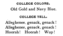
By the way, "Wup" was then Pitt's nickname (pronounced "whuup"), as in the sounding out of the acronym W.U.P. for Western University of Pennsylvania. University leaders back in the early 20th century thought the nickname sounded undignified and is one of the reasons they changed the name (along with moving the campus back into the city limits from Allegheny City).
Keep in mind, that back in the early 20th century colors weren't so technically dictated like they are with Pantone pallets now, etc. The current official collegiate colors are Pantone 281and 4515 which you can see in the official university style guide at: http://www.communications.pitt.edu/Graphic-Standards.pdf
If so, then the official colors have no meaning other than that they were the Commonwealth colors. And since the University is no longer the WUP, but now the University of Pittsburgh, the colors hold no meaning other than longevity. If the colors have no meaning then the University is free to chose chartreuse and magenta if it tickles their fancy.
If so, then the official colors have no meaning other than that they were the Commonwealth colors. And since the University is no longer the WUP, but now the University of Pittsburgh, the colors hold no meaning other than longevity. If the colors have no meaning then the University is free to chose chartreuse and magenta if it tickles their fancy.
Pitt's name is the University of Pittsburgh of the Commonwealth System of Higher Education. That is Pitt's official, legal name.
The importance of the colors is only your interpretation. I just gave you the history of them. By your interpretation, 99% colleges in America can be interpreted the same in that there is nothing to their colors but longevity itself. But, yes, it is up to the school to determine what its official colors are, and there is nothing legally binding to keep any of them from changing colors at any time. Whether changing the colors at USC, or Michigan, UNC, Ohio State, Nebraska, or Miami is an affront to tradition is up for individual interpretation. The importance of colors to effective branding and marketing is also a separate issue. Could Pitt change to Pittsburgh black & gold if it wanted to? Absolutely. What determines the colors that athletic teams wear? A school's athletic department which may or may not be subjugated to a university's overall branding guidelines at any particular point. I would think ADs are typically given some latitude. In Pitt's case, the shift to the current vegas gold was a combined effort between the university and athletic department in 1997, so you have almost 20 years of its official use which even includes the color scheme's use in the construction of permanent academic facilities, official academic seal of the university, and all matters in between. Changing colors or shades would not be instantaneous or cost free.
Last edited:
then the University is free to chose chartreuse and magenta if it tickles their fancy.
Of course they are. And if Pitt changes the school colors to chartreuse and magenta then Pitt's sports teams should wear chartreuse and magenta uniforms. Until then, Pitt should wear the current school colors.
-This is about marketing and making money. Smiley was an idiot when it came to that. Many, many, people like these new uniforms, especially the throwbacks. ESPN ran 3 different polls on this since August. And Pitt was voted best throwback uniform, destroying teams like Miami and Oregon in voting. Many fans, players, recruits, and national media love these new uniforms. And if the major majority likes it, it can help better the program. And it can give you a unique look and brand, its a homerun uniform and should be worn most home games.Despite the discussion of whether or not these are school colors or if they are ugly...I do see more and more royal blue and yellow gear in the stadium. Student section included. I am sure its being noticed.
"Pitt's name is the University of Pittsburgh of the Commonwealth System of Higher Education. That is Pitt's official, legal name."Pitt's name is the University of Pittsburgh of the Commonwealth System of Higher Education. That is Pitt's official, legal name.
The importance of the colors is only your interpretation. I just gave you the history of them. By your interpretation, 99% colleges in America can be interpreted the same in that there is nothing to their colors but longevity itself. But, yes, it is up to the school to determine what its official colors are, and there is nothing legally binding to keep any of them from changing colors at any time. Whether changing the colors at USC, or Michigan, UNC, Ohio State, Nebraska, or Miami is an affront to tradition is up for individual interpretation. The importance of colors to effective branding and marketing is also a separate issue. Could Pitt change to Pittsburgh black & gold if it wanted to? Absolutely. What determines the colors that athletic teams wear? A school's athletic department which may or may not be subjugated to a university's overall branding guidelines at any particular point. I would think ADs are typically given some latitude. In Pitt's case, the shift to the current vegas gold was a combined effort between the university and athletic department in 1997, so you have almost 20 years of its official use which even includes the color scheme's use in the construction of permanent academic facilities, official academic seal of the university, and all matters in between. Changing colors or shades would not be instantaneous or cost free.
says who?
"Pitt's name is the University of Pittsburgh of the Commonwealth System of Higher Education. That is Pitt's official, legal name."
says who?
Since 1966, Pitt's legal charter to operate as a university in the Commonwealth of Pennsylvania.
The Commonwealth System of Higher Education is collectively the state-related universities: Pitt, Penn State, Temple, and Lincoln.
Last edited:
-This is about marketing and making money. Smiley was an idiot when it came to that. Many, many, people like these new uniforms, especially the throwbacks. ESPN ran 3 different polls on this since August. And Pitt was voted best throwback uniform, destroying teams like Miami and Oregon in voting. Many fans, players, recruits, and national media love these new uniforms. And if the major majority likes it, it can help better the program. And it can give you a unique look and brand, its a homerun uniform and should be worn most home games.
Trends are also cyclical. Bright colors like the royal blue and canary yellow weren't popular in the 90s. They were in the mid-80s when they switched to those uniform shades.
Old gold was chosen because it is a close approximation to the color of a panther. Or so I have read.
We've got to be one of the only (if not the only) school who keeps tinkering with the colors to the point where fans aren't even sure anymore. It's a shame. To me, the current tanish/greenish gold is very pedestrian. As was the 'Vegas' gold before that. It does not stand out. The key is looking unique in a good way, while trying to match the school colors. Take a look at various company logos. Many have brighter gold involved... so that people notice them. You may not think that Best Buy and IKEA have great logos, but you notice them from a long distance away. They are unmistakable.
In my opinion, the throwbacks look GREAT. But, as usual we missed our chance. Gallagher and Barnes could have re-branded by going away from the current gold, but they chose not to. So now we can deal with that for the next 10 years until someone else comes along and spends millions on another change.
Unbelievable.
Last edited:
Old gold was chosen because it is a close approximation to the color of a panther. Or so I have read.
We've got to be one of the only (if not the only) school who keeps tinkering with the colors to the point where fans aren't even sure anymore. It's a shame. To me, the current tanish/greenish gold is very pedestrian. As was the 'Vegas' gold before that. It does not stand out. The key is looking unique in a good way, while trying to match the school colors. The throwbacks looked great, and making them old gold would be even better.
But, we missed out chance. Gallagher and Barnes could have re-branded by going away from the current gold, but they chose not to. So now we can deal with that for the next 10 years until someone else comes along and spends millions on another change.
Unbelievable.
Other way around. The Panther was chosen as a mascot circa 1908-1909, in part, because of its approximation to the hue old gold. Other reasons were because they were the most fierce animal once native to Western PA, was considered a heraldic noble animal in ancient civilizations, no other school at the time used the Panther, and because of alteration.
Prior to that, Pitt was still W.U.P. and it didn't have a real mascot. It's teams were typically referred to as the Varsity and the school nickname was "Wup".
I understand that. But that does not mean the official legal name of the university is "the University of Pittsburgh of the Commonwealth System of Higher Education". I have never seen it referenced as such anywhere....Sort of like saying the legal name of the Steelers is "The Pittsburgh Steelers of The National Football League"Since 1966, Pitt's legal charter to operate as a university in the Commonwealth of Pennsylvania.
The Commonwealth System of Higher Education is collectively the state-related universities: Pitt, Penn State, Temple, and Lincoln.
Which is what makes them usable and everyone appreciate them. Non-Pitt fans don't care about the historic colors or jerseys if they look drab (and they did/do) on their HDTV.GT never wore bright yellow and royal blue.They have always had the vegas gold helmets only until they recently started using the white ones like they wore today.To me, if we are going to do throwback get it right.Get the mustard gold helmets and the mustard pants and the slightly darker royal jerseys.(not like Majors 2)But early 80's.Not saying todays unis looked bad but they are just a modernized version of the late 80's jerseys.
Except EVERYONE in sports and twitter were loving them. The mustard of the early 80s is ugly.There is a reason that no one else in the country uses those colors. They are ugly. They always have been. They always will be. Some folks are so enamored with having "our own" colors that they are willing to overlook that fact. It doesn't make it any less true.
I understand that. But that does not mean the official legal name of the university is "the University of Pittsburgh of the Commonwealth System of Higher Education". I have never seen it referenced as such anywhere....Sort of like saying the legal name of the Steelers is "The Pittsburgh Steelers of The National Football League"
It is the official legal name of the university. Look on any legal document.
In fact, the PG just posted the contract between WVU and Pitt for their basketball series: http://www.post-gazette.com/sports/...-ment-s-basketball-games/stories/201610030168
The university never uses it outside of an official legal capacity...but it has to use it in official legal capacities because that is its official incorporated name.
You can also see it in the opening letter to the audited annual financial reports: http://www.cfo.pitt.edu/documents/FinancialReportFY2016.pdf
Just to be clear "the" is not part of the official name like it is at tOSU.
Here you go, the official legislation that changed the name on July 28, 1966 (see Section 3 Change of Name): http://www.legis.state.pa.us/WU01/LI/LI/US/PDF/1966/3/0003..PDF
"University of Pittsburgh--Of the Commonwealth System of Higher Education"
Temples legal name is also "Temple University—Of The Commonwealth System of Higher Education," as is Lincoln University's. Penn State's is "The Pennsylvania State University" even though it is part of the CSHE (CSHE is not a formal organization but rather a formal designation)...but it has a different history because as it evolved it always had a hybrid status and didn't require similar charter alterations to become state related. Pitt, Temple, and Lincoln were fully private until they instantaneously became state-relateds by legislative acts.
Last edited:
The traditional story is that the Commonwealth of Pennsylvania's colors were chosen for the university because between 1819 and 1908, when they were chosen, the university was named the Western University of Pennsylvania (i.e. the University of Pennsylvania, Western version). I've not been able verify this storied reasoning behind the Old Gold and Navy Blue color choice by actual historical documentation though. The oldest reference I've ever seen to blue and gold was in the October 1890 edition of the University Courant (see the below clip from that publication which I uploaded to Wikipedia):
By the way, "Wup" was then Pitt's nickname (pronounced "whuup"), as in the sounding out of the acronym W.U.P. for Western University of Pennsylvania. University leaders back in the early 20th century thought the nickname sounded undignified and is one of the reasons they changed the name (along with moving the campus back into the city limits from Allegheny City).
Keep in mind, that back in the early 20th century colors weren't so technically dictated like they are with Pantone pallets now, etc. The current official collegiate colors are Pantone 281and 4515 which you can see in the official university style guide at: http://www.communications.pitt.edu/Graphic-Standards.pdf
That's the flag of Pittsburgh, not the University of Pittsburgh's colors.
Sorry for just leaving a link on my last post on this thread. Got the post screwed up from 37000 feet via United wifi. Wanted to also note that I thought that I had read from Albert's history of the University that the blue and gold came from the Pitt family coat of arms, which is now part of the University's logo (as well as part of the City of Pittsburgh's seal).
From the University's website on the logo, the logo was adopted in 1908, though, so probably after school colors were adopted. The Pitt family coat of arms has three yellow circles presumably representing gold coins, and royal blue and white checks, the blue signifying Pitt's nobility. The University site says that the coat of arms was dropped from the University's seal in the 30's, but was reintroduced in 1974 as the University's official logo. Wasn't that the time period when the new uniform colors were introduced as well? Maybe just a coincidence....but, then again. In any case, I really think the new throwbacks are attractive and distinctive. To the extent that the colors have historical significance just makes them even more interesting.
That's purely OPINION, I think they are beautiful.There is a reason that no one else in the country uses those colors. They are ugly. They always have been. They always will be. Some folks are so enamored with having "our own" colors that they are willing to overlook that fact. It doesn't make it any less true.
Sorry for just leaving a link on my last post on this thread. Got the post screwed up from 37000 feet via United wifi. Wanted to also note that I thought that I had read from Albert's history of the University that the blue and gold came from the Pitt family coat of arms, which is now part of the University's logo (as well as part of the City of Pittsburgh's seal).
From the University's website on the logo, the logo was adopted in 1908, though, so probably after school colors were adopted. The Pitt family coat of arms has three yellow circles presumably representing gold coins, and royal blue and white checks, the blue signifying Pitt's nobility. The University site says that the coat of arms was dropped from the University's seal in the 30's, but was reintroduced in 1974 as the University's official logo. Wasn't that the time period when the new uniform colors were introduced as well? Maybe just a coincidence....but, then again. In any case, I really think the new throwbacks are attractive and distinctive. To the extent that the colors have historical significance just makes them even more interesting.
Just coincidence. The original colors were chosen when a completely different university seal was in use. Also the blue in the Pitt family coat of arms is not navy. The coat of arms is the basis of the city's seal and flag, and the university's is based on the city's.
That's purely OPINION, I think they are beautiful.
Sure, but you have no taste!
")
Just coincidence. The original colors were chosen when a completely different university seal was in use. Also the blue in the Pitt family coat of arms is not navy. The coat of arms is the basis of the city's seal and flag, and the university's is based on the city's.
Well then, a pretty cool coincidence, and a neat historical connection highlighted by the throwback colors: https://coadb.com/surnames/pitt-arms.html
Sure, but you have no taste!
I just don't want to look like GT, ND, Navy, Army, Akron and I like loud bright colors, And again, it's opinion, and IMO yours sucks.
Wow I never thought simply stating my approval of the jerseys and helmets last Saturday would turn into a debate on the official name of the University. I understand people have different opinions I was simply stating that those uniforms to ME are the best in college football. And from the amount of throwback gear I see being worn I would say most agree. Whoever referenced walking into a department store and not finding these colors obviously doesn't shop anywhere but the black and white shop because I have about 3 dress shirts about that same color blue they wore Saturday and at least 2 yellow ones close to that color and every time I wear one to work I get nothing but compliments on the colors and how much they like them. If you were wearing a jersey or helmet to the office I can see a comparison but obviously you don't so I don't get comparing finding clothes in those colors, which do actually exist, to college football jerseys. Are they the most popular color in men's dress shirts probably not but they do sell them and if you think they are ugly its your right not to buy them but don't go making statements that no one sell clothes in those colors.
For me I probably like those best because they remind me of when my dad would take me to Pitt stadium as an 8-10 year old and those are what I saw and those are what I remember Pitt being. We listened to a lot of games on the radio but actually walking in and seeing your favorite team in those jerseys left an impression on me that obviously lasted. Some kid out their may think the Dino cat helmet is the coolest thing ever. I don't like but it may have left the same impression on that 8 year old that last weeks uniforms left on me. I loved them and don't apologize to anyone for having that opinion.
For me I probably like those best because they remind me of when my dad would take me to Pitt stadium as an 8-10 year old and those are what I saw and those are what I remember Pitt being. We listened to a lot of games on the radio but actually walking in and seeing your favorite team in those jerseys left an impression on me that obviously lasted. Some kid out their may think the Dino cat helmet is the coolest thing ever. I don't like but it may have left the same impression on that 8 year old that last weeks uniforms left on me. I loved them and don't apologize to anyone for having that opinion.
Similar threads
- Replies
- 14
- Views
- 946
- Replies
- 59
- Views
- 2K
- Replies
- 0
- Views
- 242
ADVERTISEMENT
ADVERTISEMENT