
I like the Browns, Titans, Jets throwbacks. Cowboys blue uniforms are awesome. H2PThey had it right after they went back to them in ‘98. Only thing I would’ve changed is using the brighter green they have now and going with a grey facemask like the old look had. But I’m right there with you… however, it seems like all of the throwbacks they’re adopting are from the 80s, so that might be why they went with the Sack Exchange unis.
Colleges
- American Athletic
- Atlantic Coast
- Big 12
- Big East
- Big Ten
- Colonial
- Conference USA
- Independents (FBS)
- Junior College
- Mountain West
- Northeast
- Pac-12
- Patriot League
- Pioneer League
- Southeastern
- Sun Belt
- Army
- Charlotte
- East Carolina
- Florida Atlantic
- Memphis
- Navy
- North Texas
- Rice
- South Florida
- Temple
- Tulane
- Tulsa
- UAB
- UTSA
- Boston College
- California
- Clemson
- Duke
- Florida State
- Georgia Tech
- Louisville
- Miami (FL)
- North Carolina
- North Carolina State
- Pittsburgh
- Southern Methodist
- Stanford
- Syracuse
- Virginia
- Virginia Tech
- Wake Forest
- Arizona
- Arizona State
- Baylor
- Brigham Young
- Cincinnati
- Colorado
- Houston
- Iowa State
- Kansas
- Kansas State
- Oklahoma State
- TCU
- Texas Tech
- UCF
- Utah
- West Virginia
- Illinois
- Indiana
- Iowa
- Maryland
- Michigan
- Michigan State
- Minnesota
- Nebraska
- Northwestern
- Ohio State
- Oregon
- Penn State
- Purdue
- Rutgers
- UCLA
- USC
- Washington
- Wisconsin
High Schools
- Illinois HS Sports
- Indiana HS Sports
- Iowa HS Sports
- Kansas HS Sports
- Michigan HS Sports
- Minnesota HS Sports
- Missouri HS Sports
- Nebraska HS Sports
- Oklahoma HS Sports
- Texas HS Hoops
- Texas HS Sports
- Wisconsin HS Sports
- Cincinnati HS Sports
- Delaware
- Maryland HS Sports
- New Jersey HS Hoops
- New Jersey HS Sports
- NYC HS Hoops
- Ohio HS Sports
- Pennsylvania HS Sports
- Virginia HS Sports
- West Virginia HS Sports
ADVERTISEMENT
You are using an out of date browser. It may not display this or other websites correctly.
You should upgrade or use an alternative browser.
You should upgrade or use an alternative browser.
OT: NFL throwback uniforms
- Thread starter HailToPitt725
- Start date
The Reds vests were sweet. My dad's favorite player was Ted Kluszewski.I’m just waiting on the sweater vests to come back in style so the Pirates can wear them again. They looked goofy in the 2000s when Majestic was the supplier because of how baggy they looked, but I think they’d look better now with Nike.
As much as I dislike the Reds, I don’t think they’re capable of having a bad uniform. And I don’t think anyone was more famous in those vests than Kluszewski and his sleeveless look.The Reds vests were sweet. My dad's favorite player was Ted Kluszewski.
Didn't Kluszewski introduce that style? Once he modified his uniform, his teams followed suit.As much as I dislike the Reds, I don’t think they’re capable of having a bad uniform. And I don’t think anyone was more famous in those vests than Kluszewski and his sleeveless look.
That's the first photo I've ever seen of Yankees uniforms that read "Yankees". All I've ever seen is that "NY" logo on their home unis and New York on their road ones.why wouldnt baseball do these long sleeve, heavy cotton jerseys they wore back in the 20's. they look comfortable..
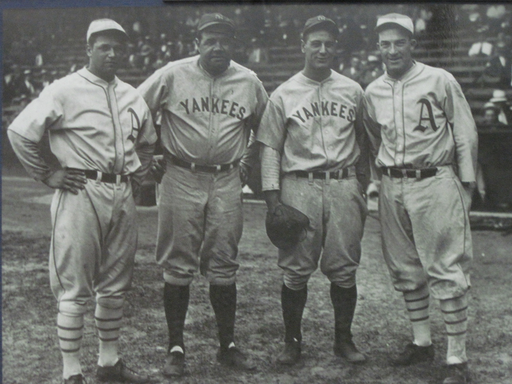
i took that from my iphone. was lucky enough to get on the field and get these guys to pose together before security grabbed me. was a great game, yanks won. it was babe ruth bobble head day so was a good crowd..That's the first photo I've ever seen of Yankees uniforms that read "Yankees". All I've ever seen is that "NY" logo on their home unis and New York on their road ones.
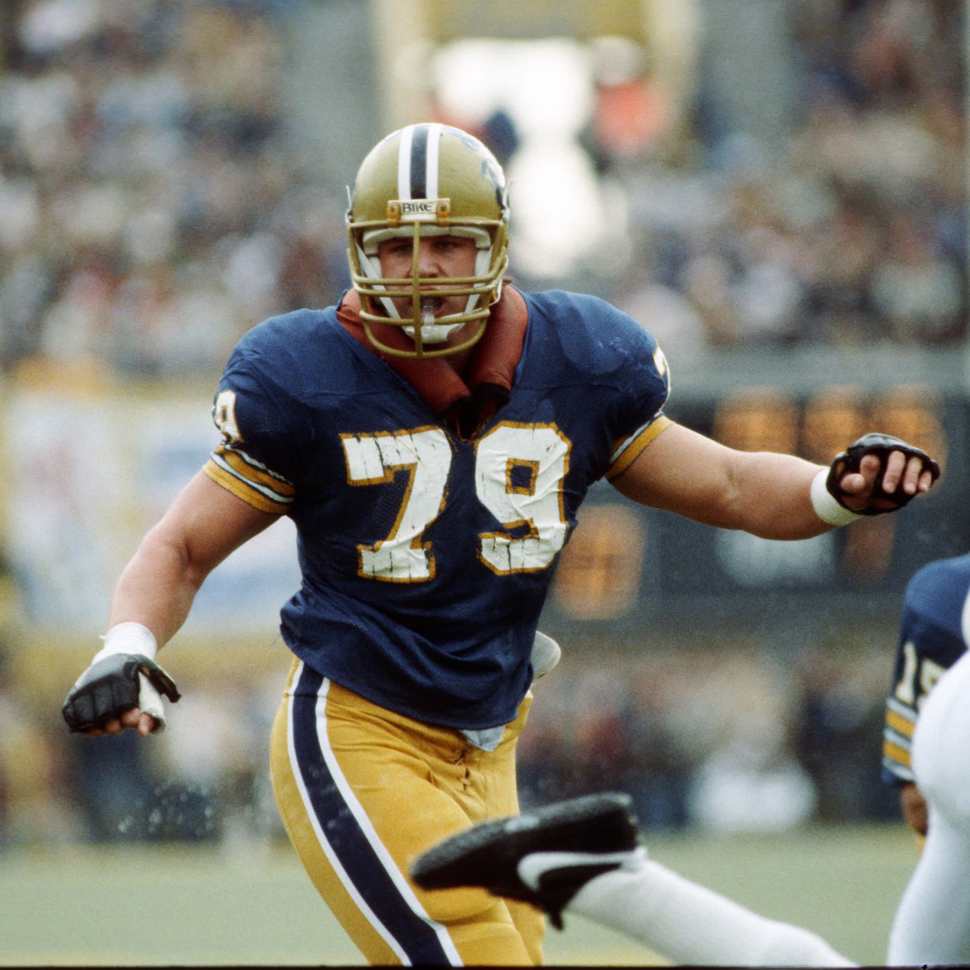
My favorite 2 uniforms are Pitt 70's early 80's and 79 Pirates. You can't go wrong with Dorsett and Stargell.As much as I dislike the Reds, I don’t think they’re capable of having a bad uniform. And I don’t think anyone was more famous in those vests than Kluszewski and his sleeveless look.
In Philadelphia?i took that from my iphone. was lucky enough to get on the field and get these guys to pose together before security grabbed me. was a great game, yanks won. it was babe ruth bobble head day so was a good crowd..
Although I love our current uniforms, I’d love to have just one throwback game where we wear those 70s darker colors.My favorite 2 uniforms are Pitt 70's early 80's and 79 Pirates. You can't go wrong with Dorsett and Stargell.
And I’m right there with you with the Pirates. They were a few years before my time and I never saw them live with the pillbox hats and mix-and-match uniforms, but I’d love to see a modern iteration of that. I’d rather have a black or gold uniform than a grey one.
That sounds familiar. Might need Pierre to confirm since he appears to be more familiar with them than me.Didn't Kluszewski introduce that style? Once he modified his uniform, his teams followed suit.
i didnt even know the A's were ever in philly.In Philadelphia?
That's where they started.i didnt even know the A's were ever in philly.
That was in my dad's time but Temple might be correctThat sounds familiar. Might need Pierre to confirm since he appears to be more familiar with them than me.
By the time I started paying attention to sports as a kid, Klu had retired, but the Pirates and Reds were both wearing them, and I was told that's how they both started.That was in my dad's time but Temple might be correct
When the Pirates went back to those yellow pill box hats 5 years ago they completely sold out.Although I love our current uniforms, I’d love to have just one throwback game where we wear those 70s darker colors.
And I’m right there with you with the Pirates. They were a few years before my time and I never saw them live with the pillbox hats and mix-and-match uniforms, but I’d love to see a modern iteration of that. I’d rather have a black or gold uniform than a grey one.
That’s why they moved from Oakland to Vegas. They’re slowly moving back east until they inevitably make their grand return to the City of Brotherly Love.i didnt even know the A's were ever in philly.

Although I love our current uniforms, I’d love to have just one throwback game where we wear those 70s darker colors.
I know we were going to get here sooner or later, haha. I just don't know that the mustard would "pop" as much as we think it would.
I'm not saying we have the perfect shades now (and they look so different depending on the lighting); I just look at the old mustard sometimes and think it's kind of ugly (or at least would be nowadays).
Like in a Notre-Dame-puke-colored-pants sort of way.
Last edited:
Oh wow niceBy the time I started paying attention to sports as a kid, Klu had retired, but the Pirates and Reds were both wearing them, and I was told that's how they both started.
Can't go wrong with both these Pitt uniforms.I know we were going to get here sooner or later, haha. I just don't know that the mustard would "pop" as much as we think it would.
I'm not saying we have the perfect shades now (and they look so different depending on the lighting); I just look at the old mustard sometimes and think it's kind of ugly (or at least would be nowadays).
Like it a Notre-Dame-puke-colored-pants sort of way.
Pretty much any long-standing franchise that’s not in the northeast or midwest originated in the northeast. Philadelphia A’s, New York Giants, Brooklyn Dodgers, Boston Braves, Washington Senators (Rangers).That's where they started.
Lol 😅That’s why they moved from Oakland to Vegas. They’re slowly moving back east until they inevitably make their grand return to the City of Brotherly Love.
And that’s why I love the look we have now. It is distinguishably Pitt. Make the gold a little darker and you’d look like Navy or Notre Dame; do the same with the blue and you’re starting to resemble WVU. The only one that comes close to our look is Cal, and that’s really only with their throw back uniform. They have more a navy/yellow look nowadays.I know we were going to get here sooner or later, haha. I just don't know that the mustard would "pop" as much as we think it would.
I'm not saying we have the perfect shades now (and they look so different depending on the lighting); I just look at the old mustard sometimes and think it's kind of ugly (or at least would be nowadays).
Like it a Notre-Dame-puke-colored-pants sort of way.
Great uniform history lessons in this thread.Pretty much any long-standing franchise that’s not in the northeast or midwest originated in the northeast. Philadelphia A’s, New York Giants, Brooklyn Dodgers, Boston Braves, Washington Senators (Rangers).
IMO our uniforms are the best in the nation. Case closed H2PAnd that’s why I love the look we have now. It is distinguishably Pitt. Make the gold a little darker and you’d look like Navy or Notre Dame; do the same with the blue and you’re starting to resemble WVU. The only one that comes close to our look is Cal, and that’s really only with their throw back uniform. They have more a navy/yellow look nowadays.
Funny enough, I’m a nerd when it comes to this stuff. Love dissecting the different looks, and there’s definitely a fascinating history to it as well. The Pro Football HOF in Canton and College FB HOF in Atlanta both do a great job at showcasing some of the trends over the years.Great uniform history lessons in this thread.
And that’s why I love the look we have now. It is distinguishably Pitt. Make the gold a little darker and you’d look like Navy or Notre Dame; do the same with the blue and you’re starting to resemble WVU. The only one that comes close to our look is Cal, and that’s really only with their throw back uniform. They have more a navy/yellow look nowadays.
Yeah, I'm honestly surprised no other P5 team has royal blue and yellow as their primary colors. Seems like a lot of high schools use that scheme (mine included). I mean, there are only so many choices. Like you have Minnesota, USC, and Arizona State (am I missing anyone?) with maroon and yellow. You have Baylor and Oregon with green and yellow. Michigan, Cal, and WVU have navy and yellow. Missouri and Iowa with black and yellow (shout out to Wiz). LSU with purple and yellow. And then you have royal blue teams like Duke, Kansas, Florida, BYU, and Kentucky. But only one royal blue and yellow team? Lol
By contrast, how many teams are some variation of red/maroon and white? Rutgers, Maryland, Louisville, NC State, Nebraska, Wisconsin, Arkansas, Stanford, Houston, Georgia, Indiana, Alabama, A&M, Oklahoma, Mississippi State, South Carolina, etc... seems like so many.
The Colts have never redesigned their helmets or for that matter their uniforms. They look the same as they did in the 1950s. Compare Johnny Unitas and Peyton Manning.Colts by far the worst.
I think the Broncos wearing old colors and bringing back the D on the helmets would be a good move.
Transformation Tuesday - The History of the Colts Uniform 1953-2016
The History of the Colts Uniform 1953-2016.
Straight up an old version of a Syracuse uniform. Similar to Virginia as well. It's a problem when teams keep updating and changing uniforms. No identity, no branding.
I love our uniforms … On our players.And that’s why I love the look we have now. It is distinguishably Pitt. Make the gold a little darker and you’d look like Navy or Notre Dame; do the same with the blue and you’re starting to resemble WVU. The only one that comes close to our look is Cal, and that’s really only with their throw back uniform. They have more a navy/yellow look nowadays.
I HATE wearing those colors myself, especially if not at a game.
I have so much Pitt gear, but for wearing in public, most are neutral gray or white shirts or hats with the gold or blue script logo (usually discreetly in the upper corners), or even more generic that that (gray t’s and hoodies with “University of Pittsburgh”.
I have a couple go to Royal blue Pitt items for attending games, if there is a “Blue out”…wore one to the D Hamlin softball game a few weeks back for example…but very rarely would throw those on a for a ‘normal’ day. Just too whack.
I’m thankful though that we don’t have purple or orange as primary colors…Hate those even more. I don’t believe I’ve ever owned a single item of clothing in purple or orange.
Or black. Not a fan. The Steelers, honestly, I have very little of their gear, not because I don’t like them, but I hate wearing black. It’s usually white or gray with discreet Steelers logo (much like my Pitt gear).
Black and silver (Raiders, etc)? Horrifying to wear. Black and purple like the Ravens? Worse.
Green is iffy. Dark green like MSU, I could handle; kind of classy. Brighter green, eh, it depends. I’d likely stop at the Jets level of green.
I really can’t imagine being a modern day Seahawks fan and ever having to wear that jackass neon green of theirs. Just couldn’t do it. I couldn’t even wear their gear to games. Grotesque.
Straight up an old version of a Syracuse uniform. Similar to Virginia as well. It's a problem when teams keep updating and changing uniforms. No identity, no branding.
Something about navy blue and orange that I've just never been a fan of. Illinois, Syracuse, Virginia, Auburn... meh. Although now that I think about it, it might just be navy blue and anything, because I don't particularly care for our old uniforms, Georgia Tech, Notre Dame, Cal, Michigan, WVU, Arizona, Ole Miss' navy blue uniforms, etc., either.
If you asked Pitt fans who their biggest rivals were at the time we switched to navy, I bet most would have said Penn State, WVU, Notre Dame... maybe Syracuse would show up in a few top fives. Hilarious(ly incompetent) that we basically emulated all of them.
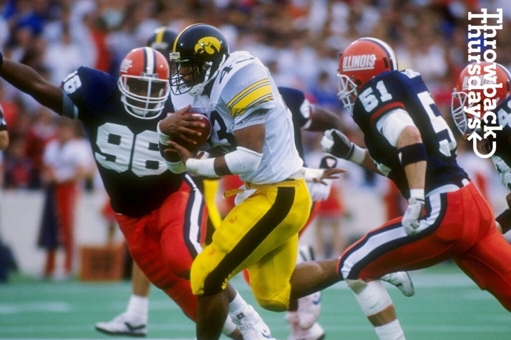
When I think of Illinois, this is what I think of:
Straight up an old version of a Syracuse uniform. Similar to Virginia as well. It's a problem when teams keep updating and changing uniforms. No identity, no branding.
They ought to bring back the script helmets. After all, we know a thing or two about that.
Actually, that franchise was born out of the original early 1960s expansion, to replace the original Senators (who became the Twins).Washington Senators (Rangers).
Correct, that was a mistake on my part. Appreciate the clarification. Always got the Twins/Rangers mixed up between their Washington ties.Actually, that franchise was born out of the original early 1960s expansion, to replace the original Senators (who became the Twins).
Yeah, what a rabbit hole you could down with that ... does that mean the Browns never move, and the Browns led by Ray Lewis win the 2001 super bowl? And then Lebron doesn't have to go back to Cleveland to end the city's championship drought? Etc.Baltimore went about it the wrong way. Instead of suing for the rights to the identity, they straight up tried to eminent domain an NFL franchise, lol.
Although, had that worked, there’s likely a lot of ramifications. The Colts remain in Baltimore, which likely means that the Cardinals relocate to Indianapolis instead of Arizona since they had the Hoosier Dome ready for any relocated team. Phoenix then likely gets the Jacksonville franchise.
When I think of Illinois , this is what I think of :When I think of Illinois, this is what I think of:
They ought to bring back the script helmets. After all, we know a thing or two about that.
Alex Van Pelt?
Seeing TD's shoes from his 99.5 yard TD run was the highlight of my visit to the Pro Football Hall Of Fame. Dallas only had 10 men on the field. Awesome run!!!! H2PFunny enough, I’m a nerd when it comes to this stuff. Love dissecting the different looks, and there’s definitely a fascinating history to it as well. The Pro Football HOF in Canton and College FB HOF in Atlanta both do a great job at showcasing some of the trends over the years.
Last edited:
I agree. I always had a soft spot for those unis when I was young. Side note: why doesn’t Syracuse just use the McNabb era unis. As a program, wear the unis that you’ve had on field success with.When I think of Illinois, this is what I think of:
They ought to bring back the script helmets. After all, we know a thing or two about that.
Similar threads
- Replies
- 20
- Views
- 1K
- Replies
- 28
- Views
- 2K
- Replies
- 10
- Views
- 906
- Replies
- 40
- Views
- 6K
- Replies
- 21
- Views
- 1K
ADVERTISEMENT
Latest posts
-
-
-

-
-
Bostick interview- Get out the KY Jelly and rubber gloves
- Latest: KennyHeisman8
ADVERTISEMENT