
All white uniforms rarely look good. They never look good when you have sweet regular uniforms. At least no one will recognize it's Pitt whenever they happen to wear these.
Colleges
- American Athletic
- Atlantic Coast
- Big 12
- Big East
- Big Ten
- Colonial
- Conference USA
- Independents (FBS)
- Junior College
- Mountain West
- Northeast
- Pac-12
- Patriot League
- Pioneer League
- Southeastern
- Sun Belt
- Army
- Charlotte
- East Carolina
- Florida Atlantic
- Memphis
- Navy
- North Texas
- Rice
- South Florida
- Temple
- Tulane
- Tulsa
- UAB
- UTSA
- Boston College
- California
- Clemson
- Duke
- Florida State
- Georgia Tech
- Louisville
- Miami (FL)
- North Carolina
- North Carolina State
- Pittsburgh
- Southern Methodist
- Stanford
- Syracuse
- Virginia
- Virginia Tech
- Wake Forest
- Arizona
- Arizona State
- Baylor
- Brigham Young
- Cincinnati
- Colorado
- Houston
- Iowa State
- Kansas
- Kansas State
- Oklahoma State
- TCU
- Texas Tech
- UCF
- Utah
- West Virginia
- Illinois
- Indiana
- Iowa
- Maryland
- Michigan
- Michigan State
- Minnesota
- Nebraska
- Northwestern
- Ohio State
- Oregon
- Penn State
- Purdue
- Rutgers
- UCLA
- USC
- Washington
- Wisconsin
High Schools
- Illinois HS Sports
- Indiana HS Sports
- Iowa HS Sports
- Kansas HS Sports
- Michigan HS Sports
- Minnesota HS Sports
- Missouri HS Sports
- Nebraska HS Sports
- Oklahoma HS Sports
- Texas HS Hoops
- Texas HS Sports
- Wisconsin HS Sports
- Cincinnati HS Sports
- Delaware
- Maryland HS Sports
- New Jersey HS Hoops
- New Jersey HS Sports
- NYC HS Hoops
- Ohio HS Sports
- Pennsylvania HS Sports
- Virginia HS Sports
- West Virginia HS Sports
ADVERTISEMENT
You are using an out of date browser. It may not display this or other websites correctly.
You should upgrade or use an alternative browser.
You should upgrade or use an alternative browser.
New white helmets leaked
- Thread starter TheWerewolfFromTwilight
- Start date

I’m just gonna say no way they came up with this idea this weekAt the risk of sounding like another poster here, I called it, a preposterous uniform alteration to try to distract from the crappiness. It’s the last refuge of a failed program that doesn’t give a sh1t.
I kind of like getting away from the neon Royal blue and more towards a muted royal blue like the late 70s. They should go to that, if they HAVE to change anything. But of course they’ll go full spheres-in hideous. This U is so lucky far too many kids go to college now and keep it in business. It seems to do nothing right
That’s absurd. They don’t paint the helmets or something. That alternative stuff is figured out preseason.
At least we didn’t blame the unplanned layover last week like Mike Tomlin did for the Steelers loss todayI thought of you when I saw this. You called it for sure. We cant win in football but we can distract with new uniforms. This program is crashing and burning and the solution seems to be new uniforms. It would be funny if it wasnt so sad.
I think those look awesome. Anyone that thinks that looks like a Penn State helmet is blind. For starters, how about it says Pitt on the side. The stripe isn’t navy blue, and is outlined in yellow. Get a grip. The players and recruits love this stuff. Oregon was the coolest brand out there for a good decade because of this kind of stuff. With that being said, who cares what they wear, just win games.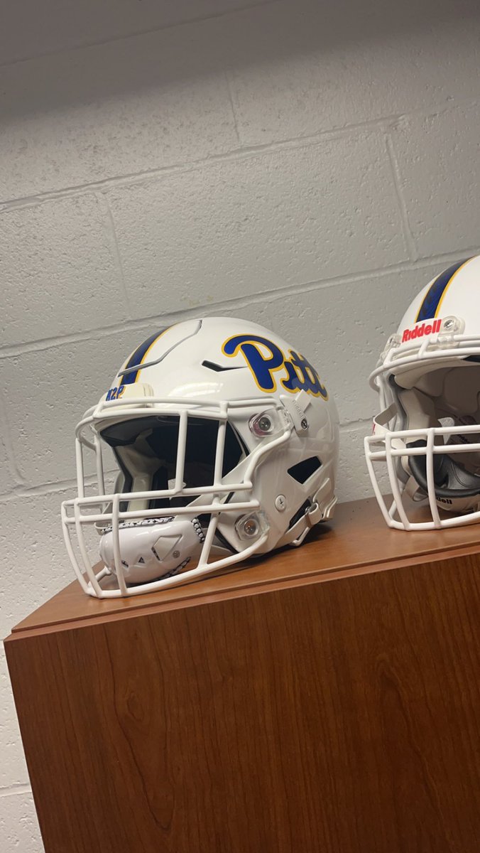
They're not bad, but all white uniforms have always been stupid to me. So many teams have had them for years as just a regular ugly uniform, and now people act like it's some brand new happenin' thang. Kind of plain for my tastes. I think they would look sharp with white pants and a blue jersey, but we all know (thanks to Kentucky's 3rd string DE, Tyreese Fearbry) that the "icy whites" are coming.
IMO I like the white helmets but would appreciate these more if we were winning. H2P
Cuse game maybe?PJ O'Brien had something about it on his Instagram, so I assume it's coming this season.
Pope fest uni. I mean the Pope wears many colors depending on the situation however icy white is by far the classic look.
No nameplates were Hackett eraTeam doesn’t deserve alternate uniforms. They don’t even deserve nameplates on the back
I think we actually won that game vs Louisville.I think you are thinking of the NC St.game we choked away at the end.Those are locked up in the catacombs of the Cathedral along with the all-gold Adidas uniforms, never to be seen or heard from again.
Why must we always wear the worst possible alternate uniforms against them? It makes sense now if we wear the white helmets next Saturday.
And that was a bad era.Choking games right and left.Especially 1991.No nameplates were Hackett era
I think those look awesome. Anyone that thinks that looks like a Penn State helmet is blind. For starters, how about it says Pitt on the side. The stripe isn’t navy blue, and is outlined in yellow. Get a grip. The players and recruits love this stuff. Oregon was the coolest brand out there for a good decade because of this kind of stuff. With that being said, who cares what they wear, just win games.
Rape U has white helmets. That's kinda their thing along with raping. Let them have their white helmets. I dont want to look anything like Rape U.
Oh I know we won, but we still wore those awful uniforms. Was never a fan of the “steel panther” look both times we tried it (counting 2010). Just my opinion, though.I think we actually won that game vs Louisville.I think you are thinking of the NC St.game we choked away at the end.
Rape U?? Damn, tell us how you really feel.Rape U has white helmets. That's kinda their thing along with raping. Let them have their white helmets. I dont want to look anything like Rape U.
I like the helmets. Make the face mask blue and lose the logo, and it's near perfect!
Yeah like practice uniforms in honor of the fighting Jerry's.Rape U?? Damn, tell us how you really feel.
I like the helmets. Make the face mask blue and lose the logo, and it's near perfect!
One of the regretful things off when we bring in one of our more recent great players, like Fitzgerald 2 weeks back, is that we (and the player himself) has to endure the highlights of their past on the scorecard wearing the hideous uniforms of their particular few seasons.
As I wrote above, the constant changing of uniforms and colors and silly gimmicky fonts reflects a really lazy, indifferent AD and administration. Horrible problems with the program? Gear sales going through the sewer? Hard work and expensive to correct? F doing that, especially if it’s football … just change the uniform, or the colors, or hustle out an ugly “alternate” version … a portion of the unwashed will lap it up.
As I wrote above, the constant changing of uniforms and colors and silly gimmicky fonts reflects a really lazy, indifferent AD and administration. Horrible problems with the program? Gear sales going through the sewer? Hard work and expensive to correct? F doing that, especially if it’s football … just change the uniform, or the colors, or hustle out an ugly “alternate” version … a portion of the unwashed will lap it up.
I mean whatever on this because I just want wins but I think the Pitt and the stripe should be primarily gold and not blue. Inverse the colors. Hopefully stripes down leg to match.
Yeah, but we have largely done it right since the rebrand. The logo and colors aren’t going anywhere this time.One of the regretful things off when we bring in one of our more recent great players, like Fitzgerald 2 weeks back, is that we (and the player himself) has to endure the highlights of their past on the scorecard wearing the hideous uniforms of their particular few seasons.
As I wrote above, the constant changing of uniforms and colors and silly gimmicky fonts reflects a really lazy, indifferent AD and administration. Horrible problems with the program? Gear sales going through the sewer? Hard work and expensive to correct? F doing that, especially if it’s football … just change the uniform, or the colors, or hustle out an ugly “alternate” version … a portion of the unwashed will lap it up.
Different color helmets or combos a couple times a year? Why not? Kids like that. Just no “steel gray” type stuff.
I also don’t mind the “nod to Pittsburgh” idea, but both have missed the mark. In addition to the weird gray uniforms, the giant P in black n gold was a missed opportunity in hoops. Just put a script Pitt on there.
This could look ok as long as they don't go all white. The Chargers have some sharp combos with white helmets.
With that said, I'm expecting all white because... well... that's the worst option.
With that said, I'm expecting all white because... well... that's the worst option.
The worst (but at least humorous) aspect is that Pitt will likely give a promotion and bonus to the cherub that came up (more like recycled) with this idea/design to “respond” to the spiraling of the program. Like a new hat for Malibu Stacey…This could look ok as long as they don't go all white. The Chargers have some sharp combos with white helmets.
With that said, I'm expecting all white because... well... that's the worst option.
Similar threads
- Replies
- 19
- Views
- 2K
- Replies
- 28
- Views
- 2K
ADVERTISEMENT
ADVERTISEMENT